UI Compare
Updated
Issues
| Element | Prototype | Production |
|---|---|---|
| Page subtitle color | color: var(--m__text)Prototype changed. Capture again to compare. | color: rgb(150, 150, 170)Recommendation: Use color: var(--m__text) for page descriptions in the shared subtitle style. Found in 9 places
|
| Control and table padding | padding: var(--m__padding-button-s)Prototype changed. Capture again to compare. | padding: 9.44px 18.88pxRecommendation: Align internal spacing in buttons, table cells, segmented controls and inputs with their matching DS components and size variants. Use --m__padding-button-s/m for buttons, --m__padding-button-s for segmented controls, --m__padding-input-s/m for inputs, and the shared DS table cell styles. The values above illustrate the reviewed API Keys dialog Cancel/Create buttons; they are not a universal padding for all controls. Apply the component-specific spacing across the linked pages. Found in 13 places
|
Pages
| Route | Prototype | Production |
|---|---|---|
Pricing |  Prototype changed. Capture again to compare. 
View data diffThe header differs because production is captured signed in and the prototype signed out. The model catalogs differ: the prototype adds an Analysis group (Velma, Velma Agentic) and more Triage, Transcription and Detection entries. Confirm the current catalog before treating these as defects. Prices, limits and supported languages also differ. Captured 30 September 2026 with field replacement before rendering; names, emails, organizations, IDs and account values use synthetic values. | |
Playground — Velma Triage | 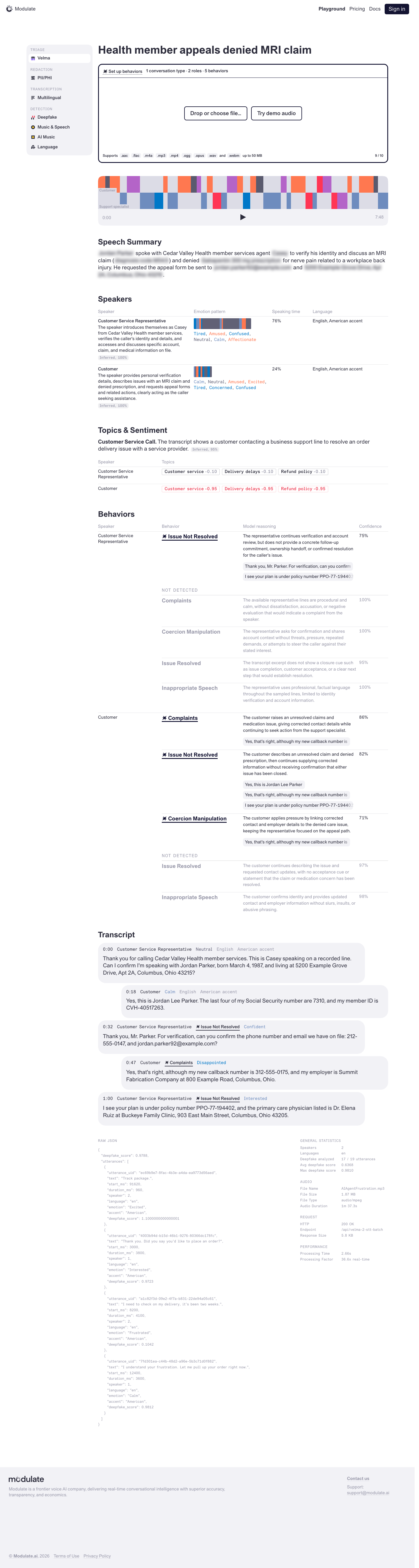 Prototype changed. Capture again to compare. — | |
Playground — PII/PHI Redaction | 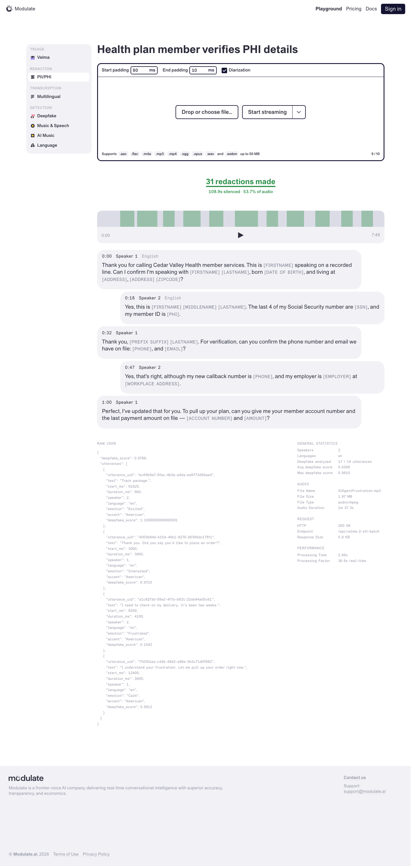 Prototype changed. Capture again to compare. — | |
Playground — Multilingual Transcription | 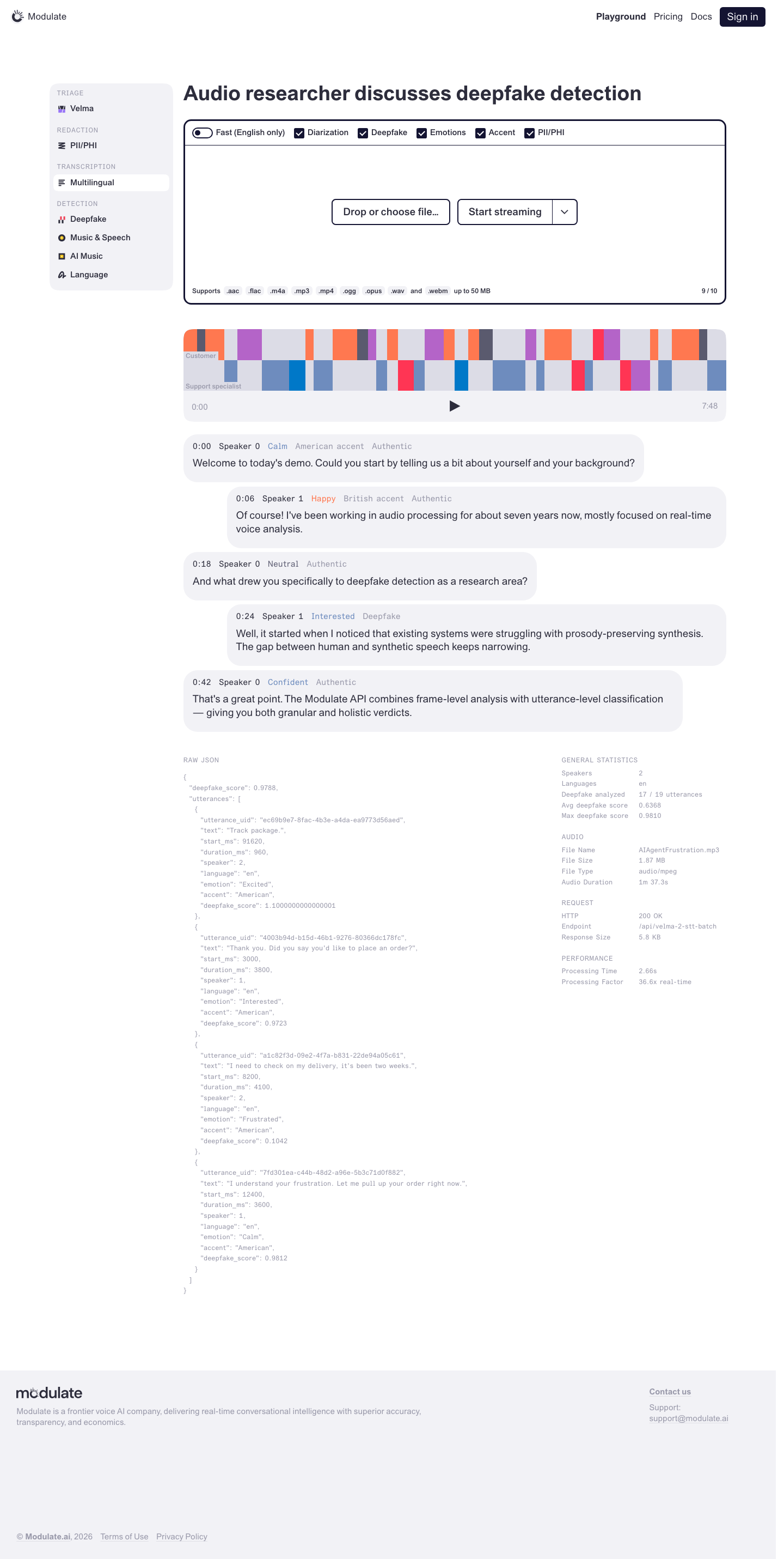 Prototype changed. Capture again to compare. — | |
Playground — Deepfake Detection | 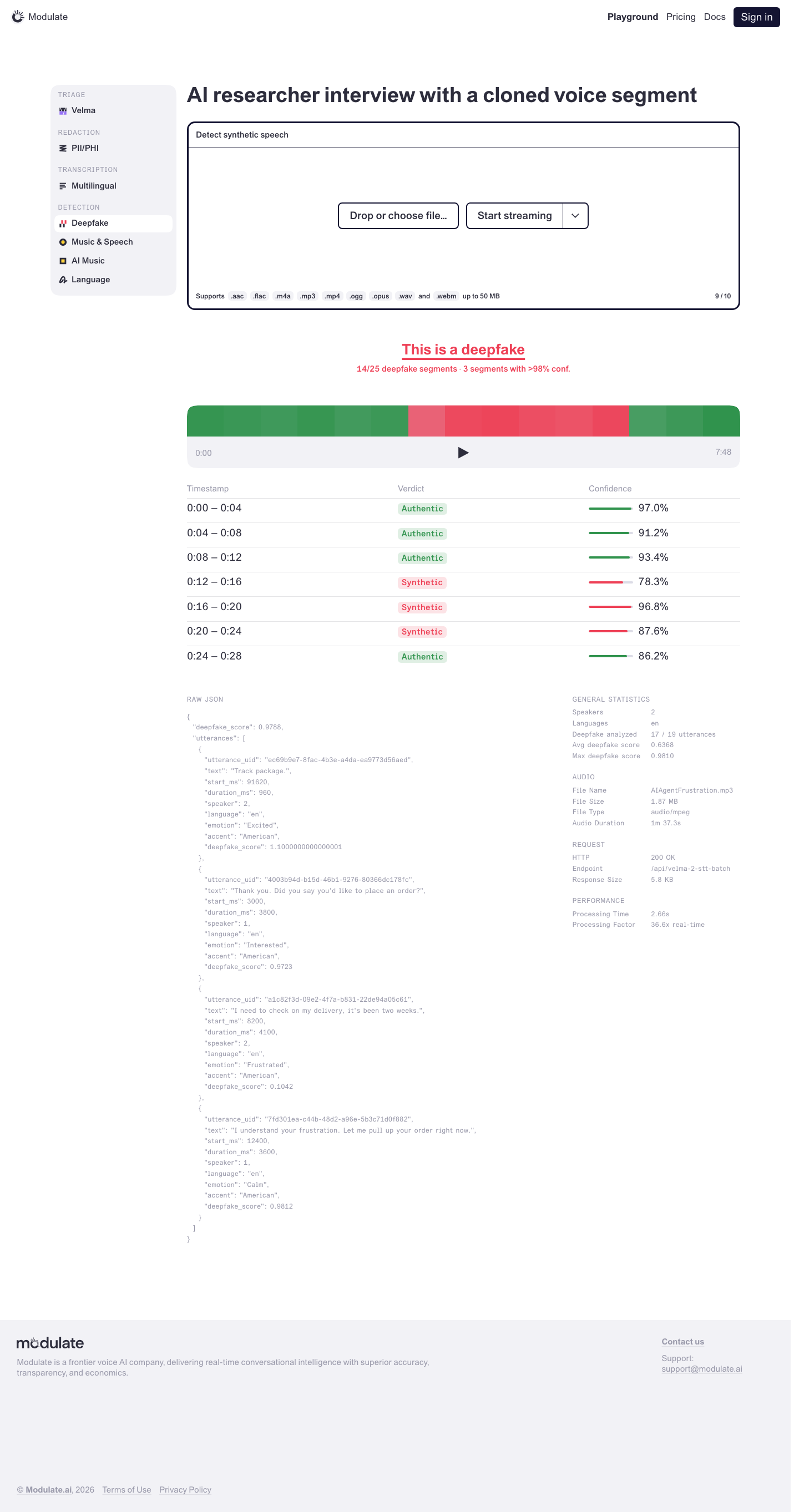 Prototype changed. Capture again to compare. — | |
Playground — Music & Speech Detection | 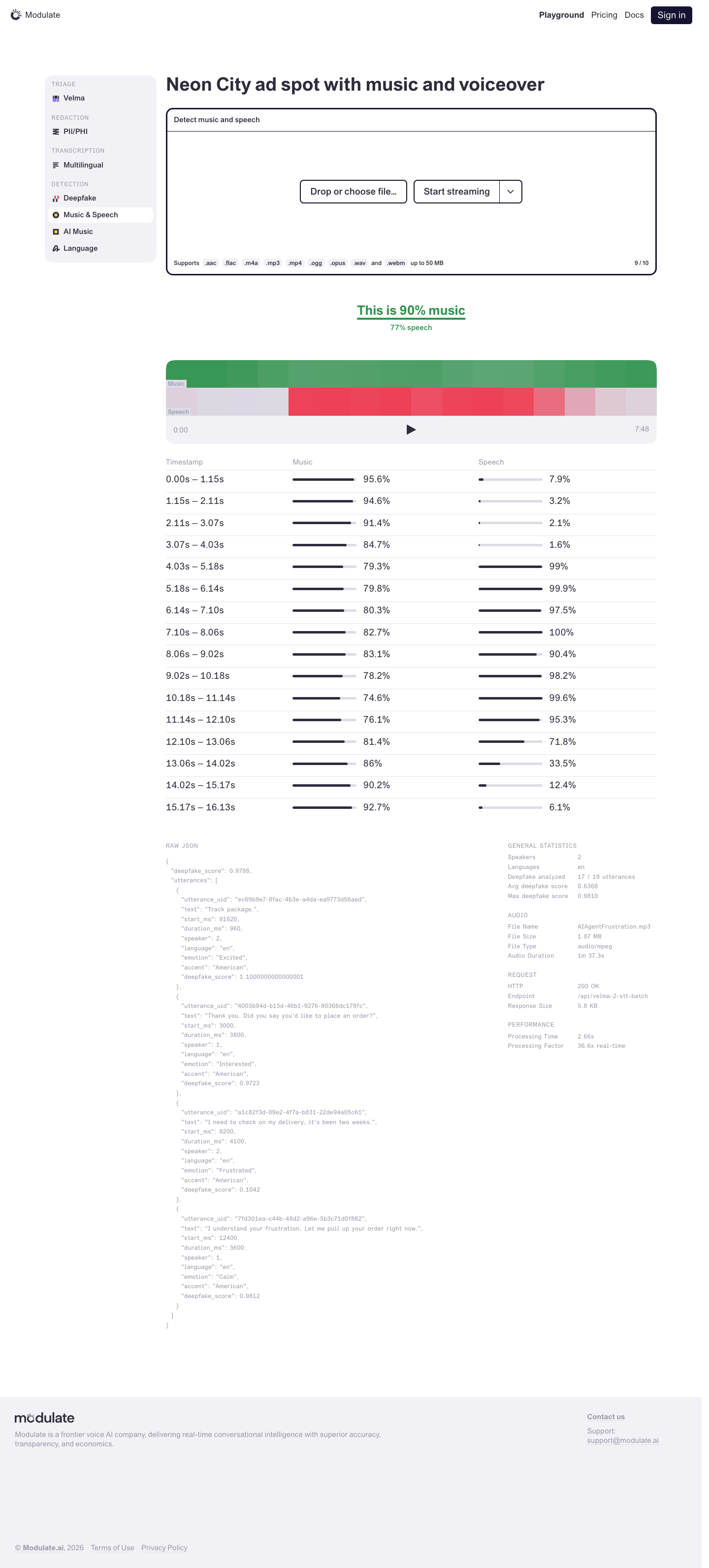 Prototype changed. Capture again to compare. — | |
Playground — AI Music Detection | 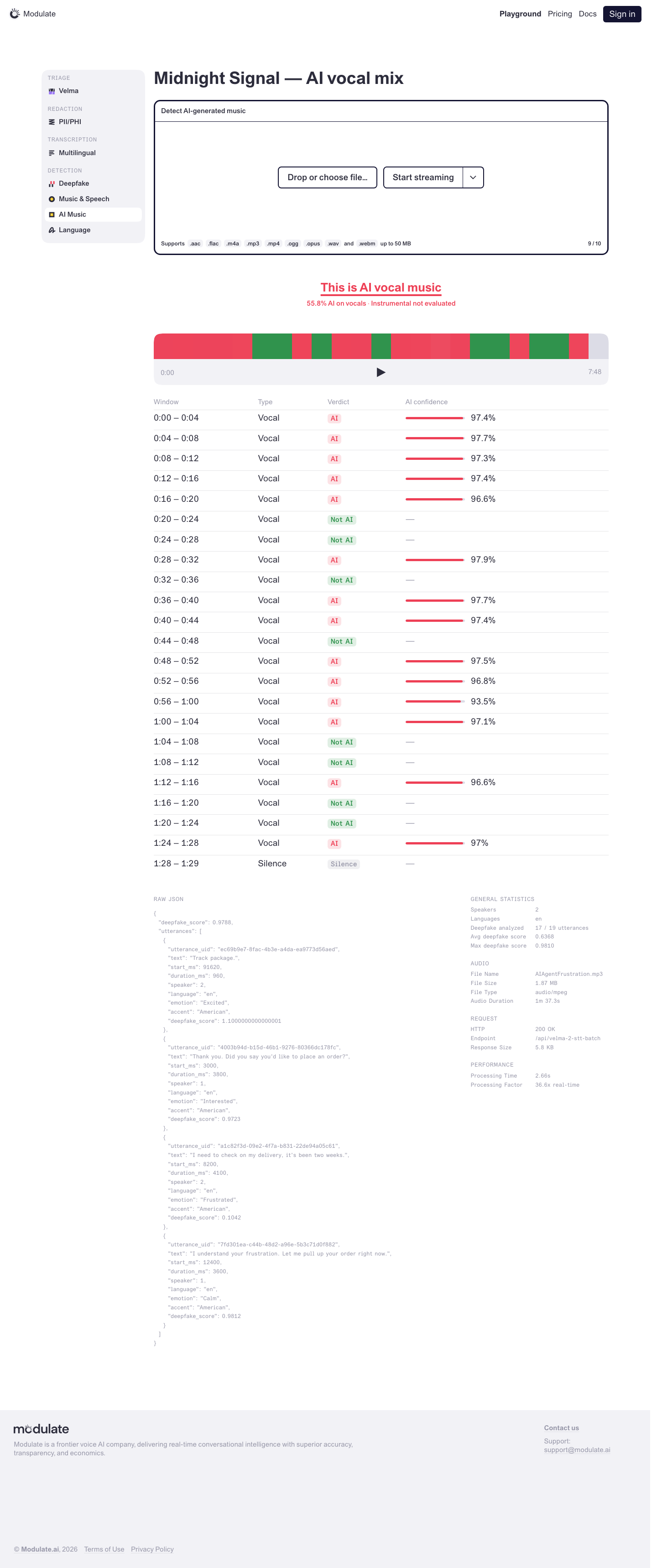 Prototype changed. Capture again to compare. — | |
Playground — Language Detection | 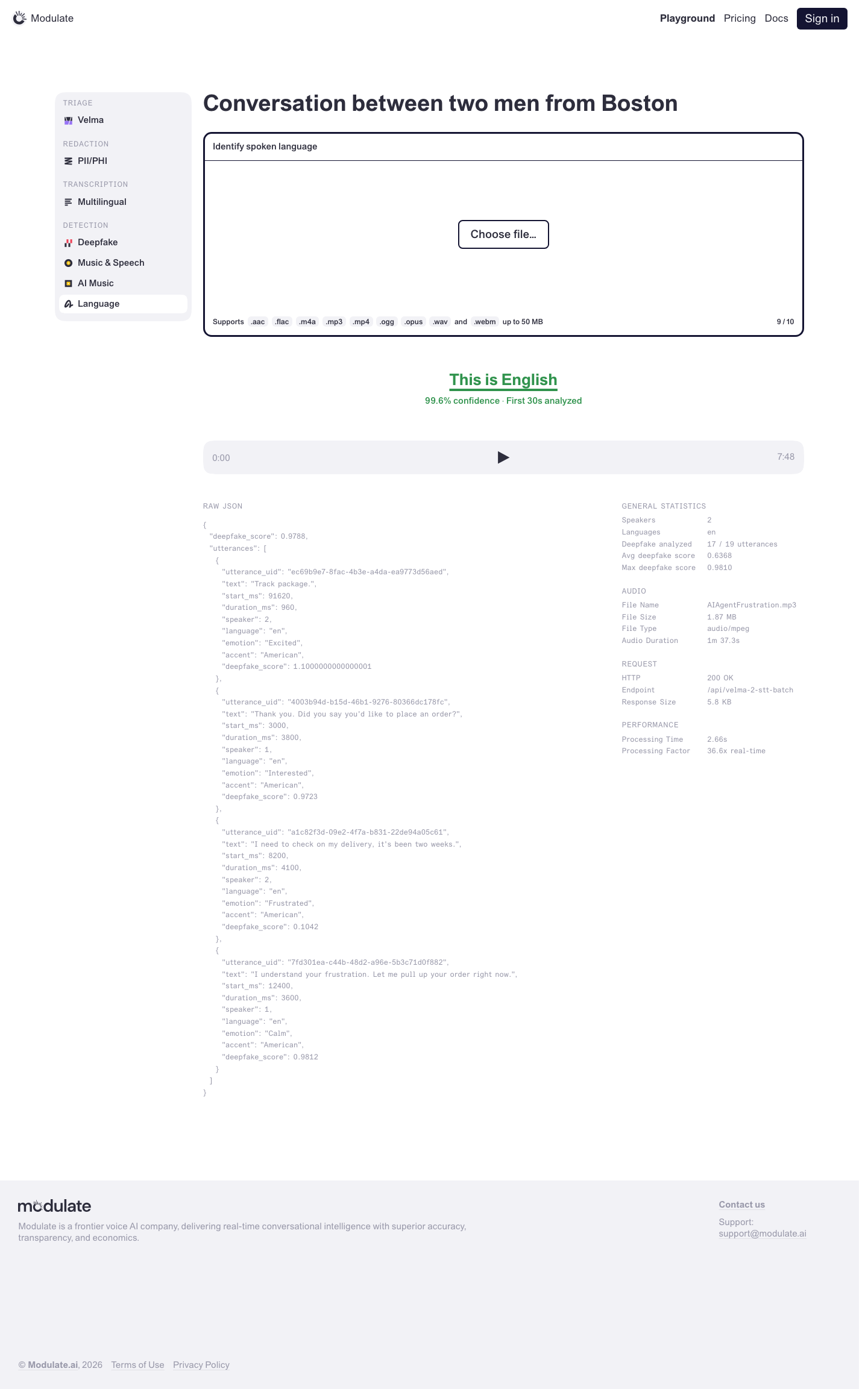 Prototype changed. Capture again to compare. — | |
Browse Conversations | 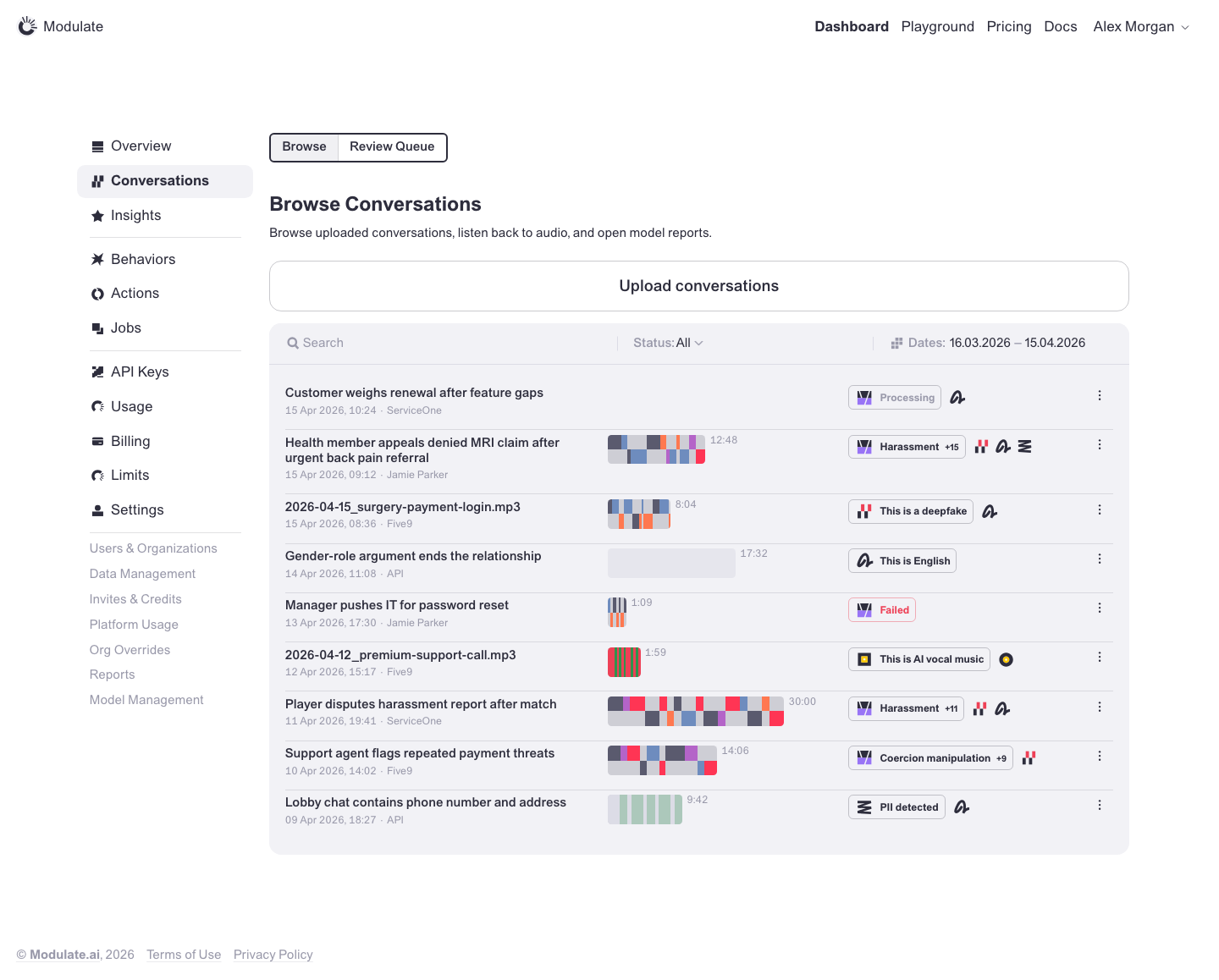 Prototype changed. Capture again to compare. 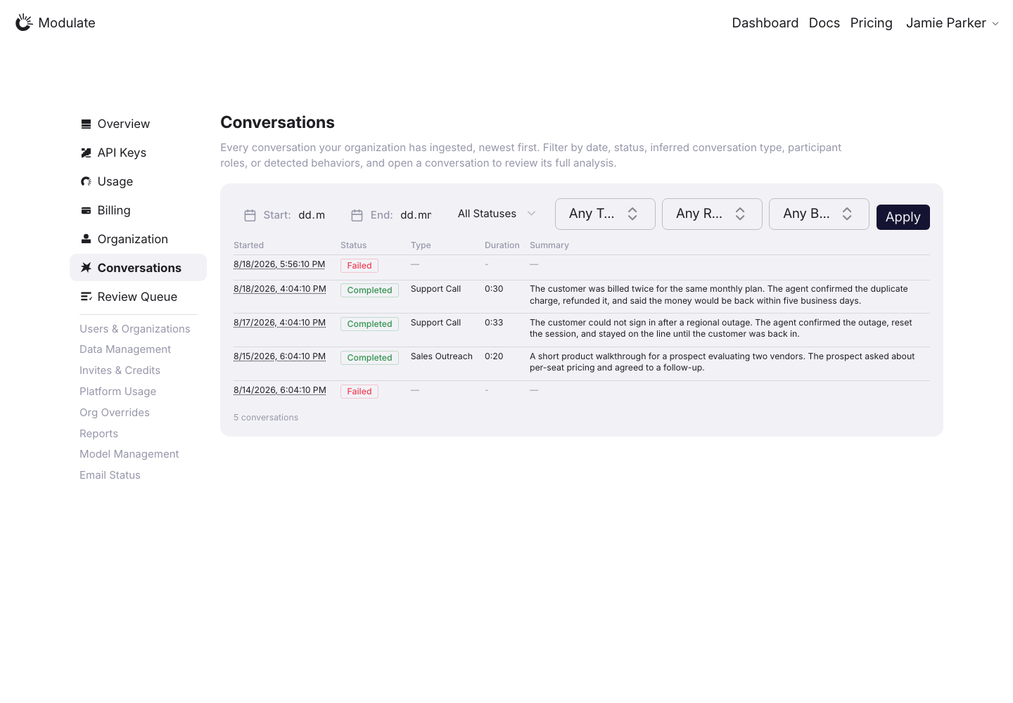
Linked issuesView data diffUpload conversations is absent from the production capture; verify availability for the intended role. Conversation text and counts depend on data. Captured 30 September 2026 with field replacement before rendering; names, emails, organizations, IDs and account values use synthetic values. | |
Create Conversation | 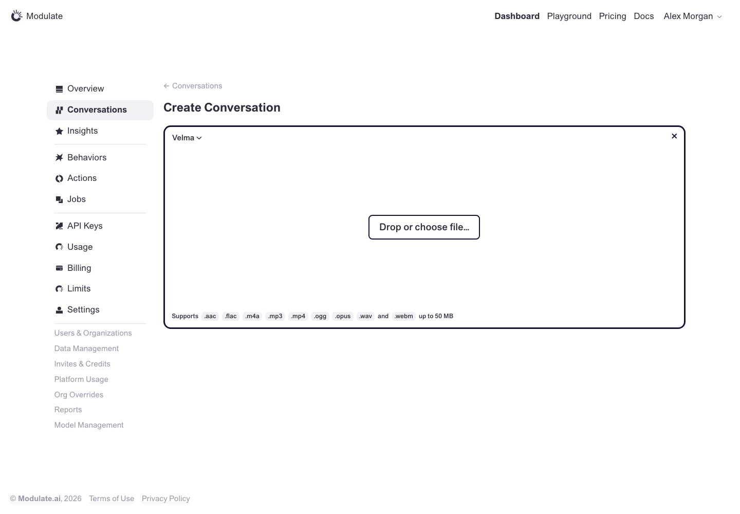 Prototype changed. Capture again to compare. — | |
Review Queue | 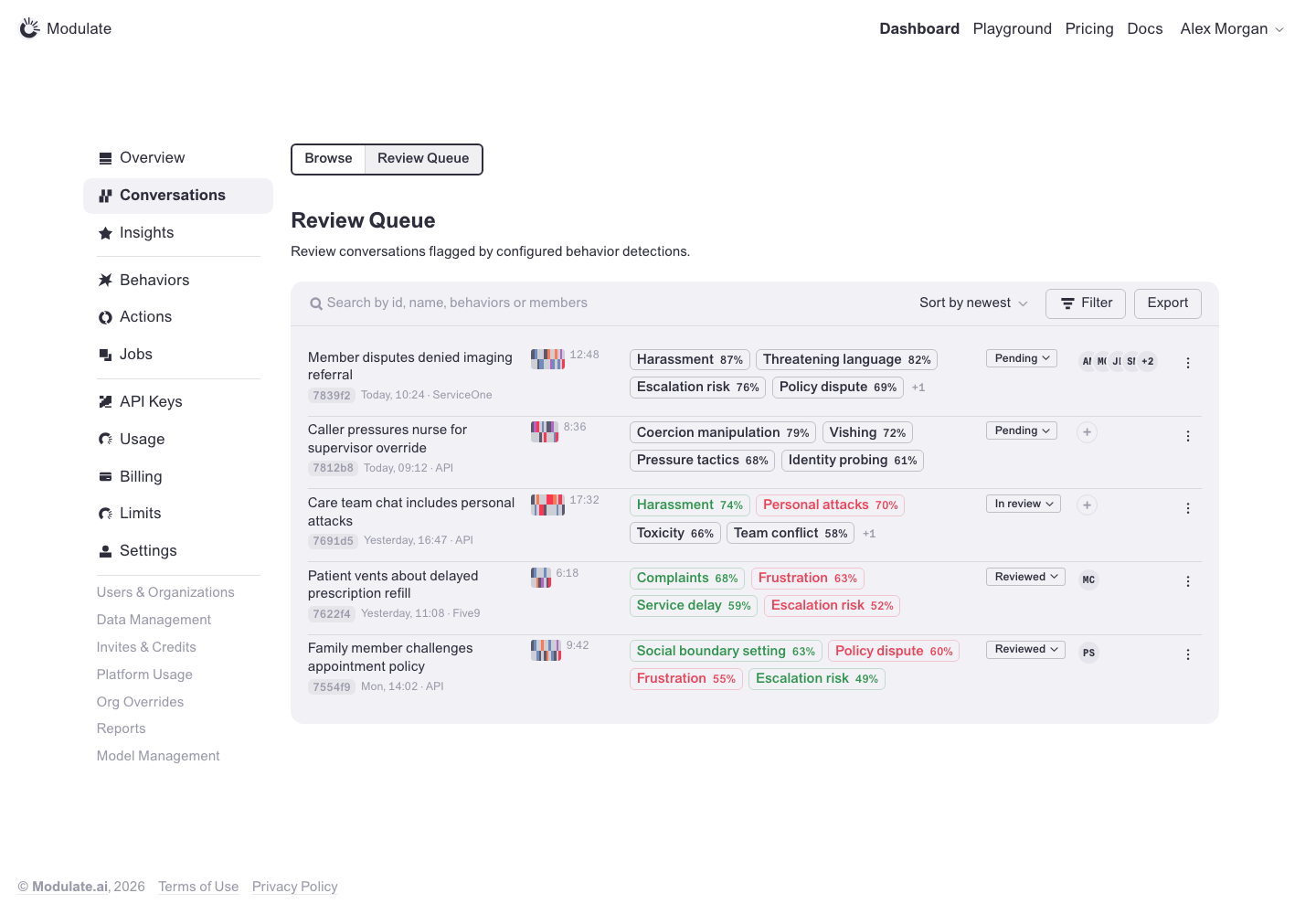 Prototype changed. Capture again to compare. 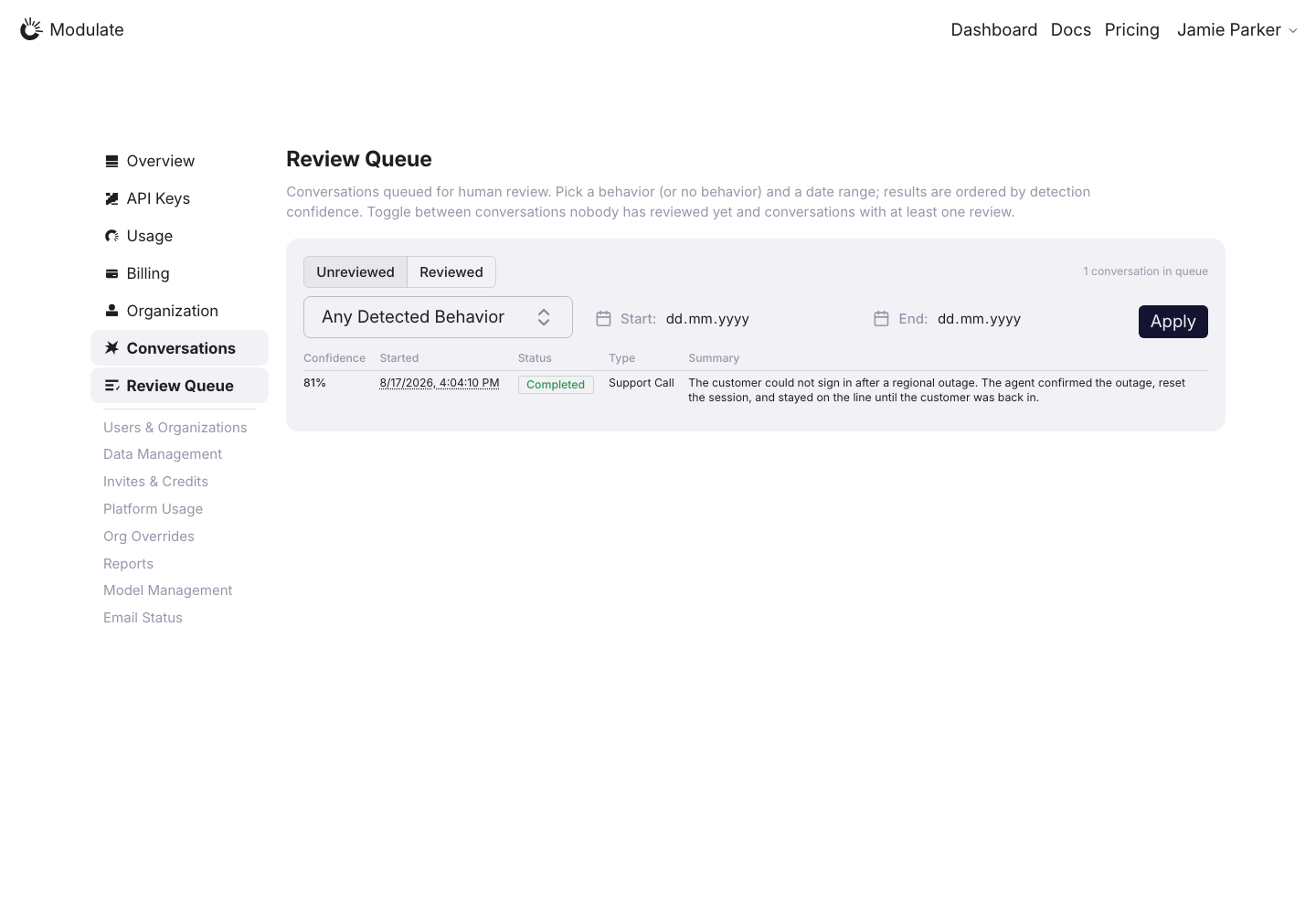
Linked issuesView data diffProduction uses /dashboard/conversations/review-queue. Compare this mapped route with the prototype review queue. Captured 30 September 2026 with field replacement before rendering; names, emails, organizations, IDs and account values use synthetic values. | |
Conversation Review | 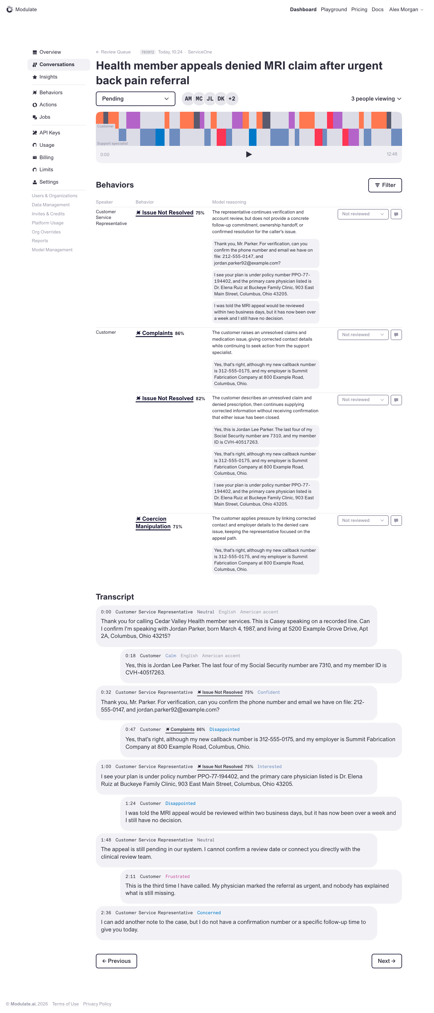 Prototype changed. Capture again to compare. 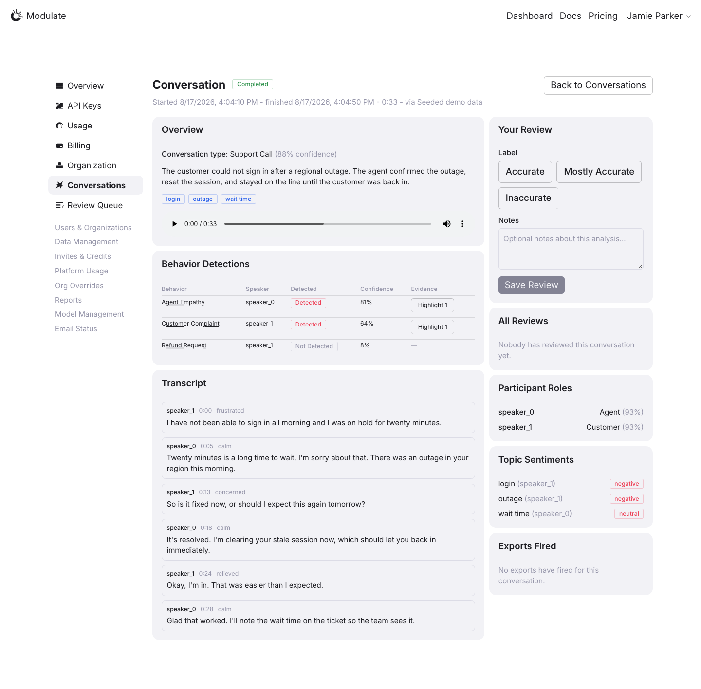
Linked issuesView data diffProduction uses the same conversation page for the report and Review Queue detail. Both Compare rows reuse the same saved production image. Production and prototype contain different conversations. Text, duration, detection counts and confidence values are data differences. Completed describes processing, while Pending / In review / Reviewed describes the prototype review workflow. Captured 30 September 2026 with field replacement before rendering; names, emails, organizations, IDs and account values use synthetic values. | |
Conversation Report | 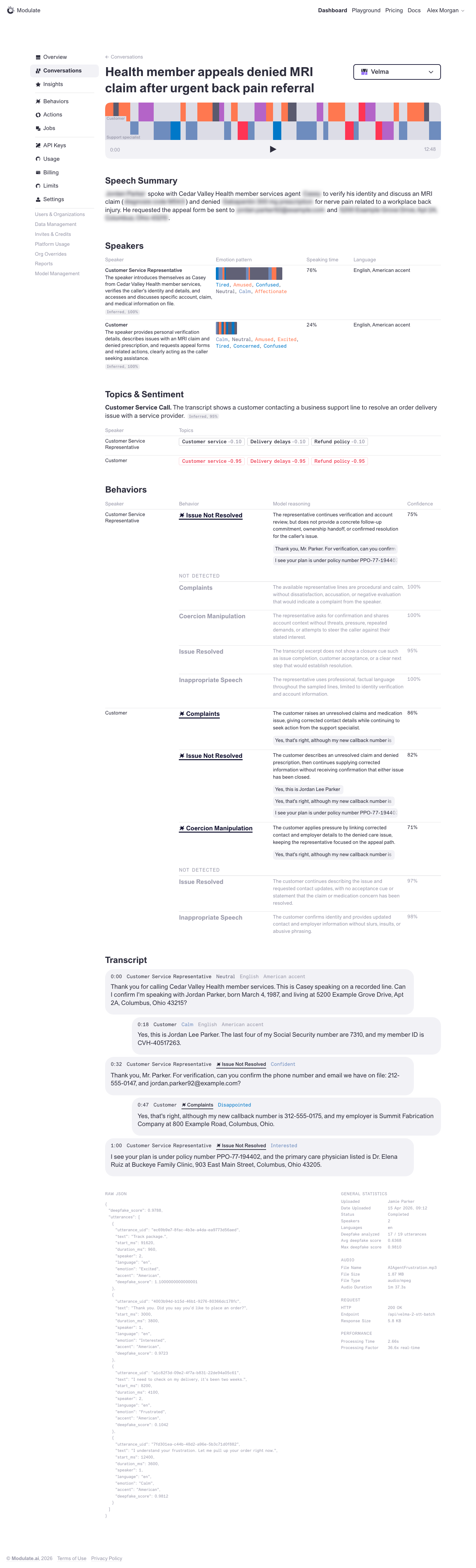 Prototype changed. Capture again to compare.
Linked issuesView data diffThe production capture is the seeded support call supplied for this review. The prototype uses a different conversation fixture; utterances, duration, scores and the number of results are data differences. The production page combines analysis and review controls. Confirm the intended scope of Conversation Report versus Conversation Review before treating the extra review cards as defects. Captured 30 September 2026 with field replacement before rendering; names, emails, organizations, IDs and account values use synthetic values. | |
Insights | 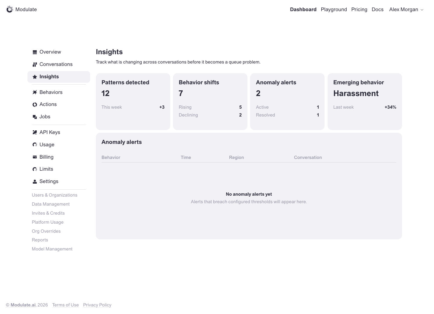 Prototype changed. Capture again to compare. — | |
Overview | 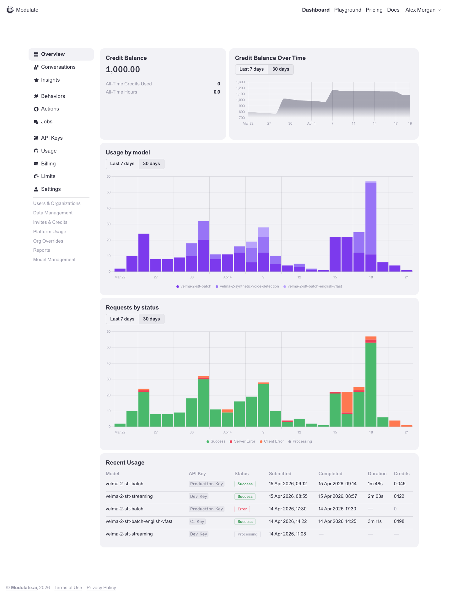 Prototype changed. Capture again to compare. 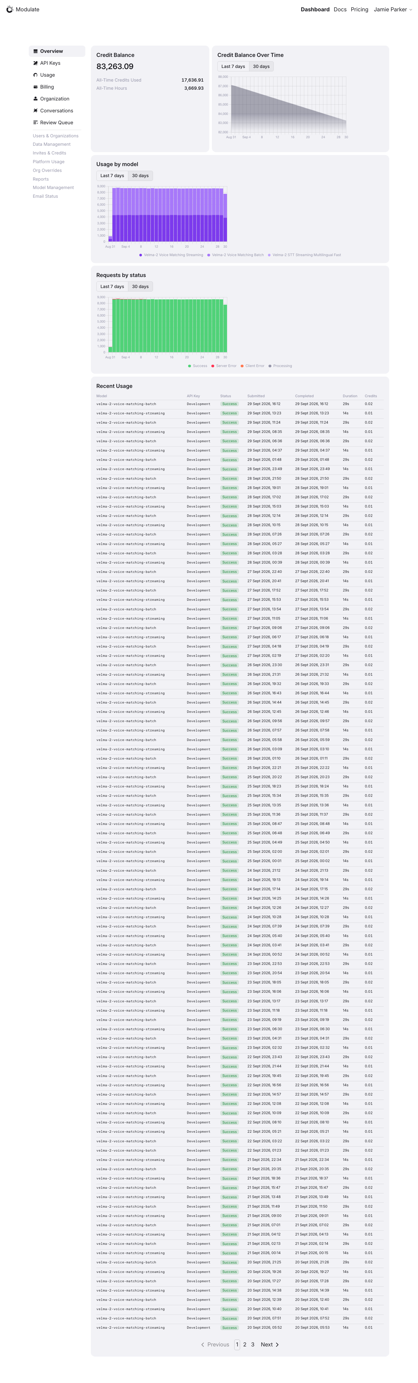
Linked issuesView data diffInsights, Behaviors, Actions, Jobs and Limits are absent from the captured sidebar; availability depends on role. The main sections match: balance, three charts and Recent Usage. Values, periods, models, row counts and pagination vary with live data. Captured 1 October 2026 with field replacement before rendering; names, emails, API key names and timestamps use synthetic values. Credit balances and amounts are shown unchanged. | |
API Keys | 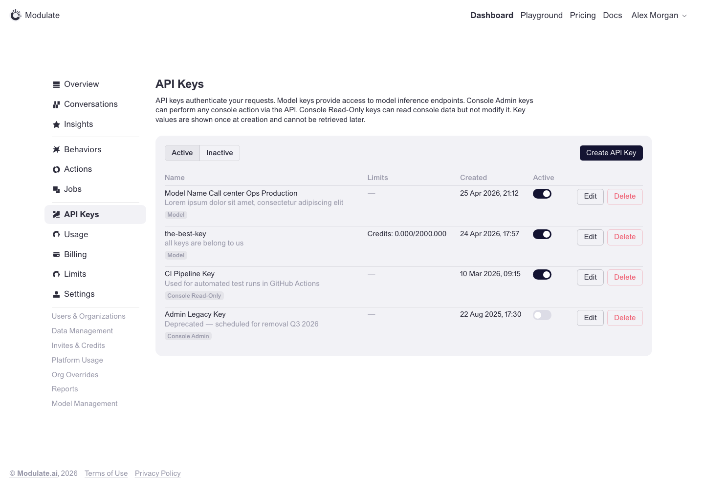 Prototype changed. Capture again to compare. 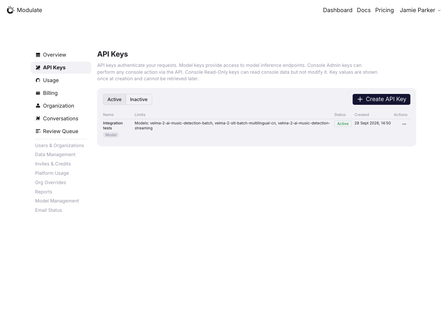
Linked issuesView data diffProduction shows one key and the prototype shows four; key names, limits and dates are data differences. Captured 30 September 2026 with field replacement before rendering; names, emails, organizations, IDs and account values use synthetic values. | |
API Keys: Create key | 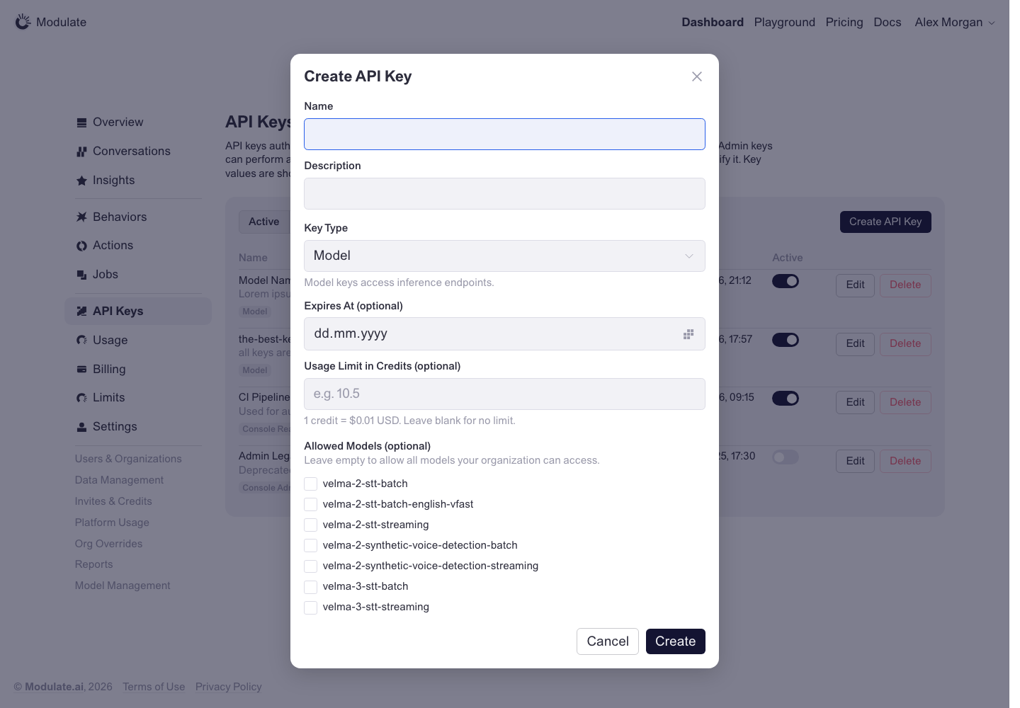 Prototype changed. Capture again to compare. 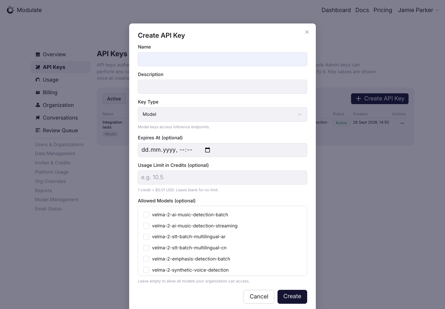
Linked issuesView data diffConfirm the intended date/time functionality and model catalog before changing the controls. Pixel measurements are from the saved 1440 px viewport. Captured 30 September 2026 with field replacement before rendering; names, emails, organizations, IDs and account values use synthetic values. | |
Models | 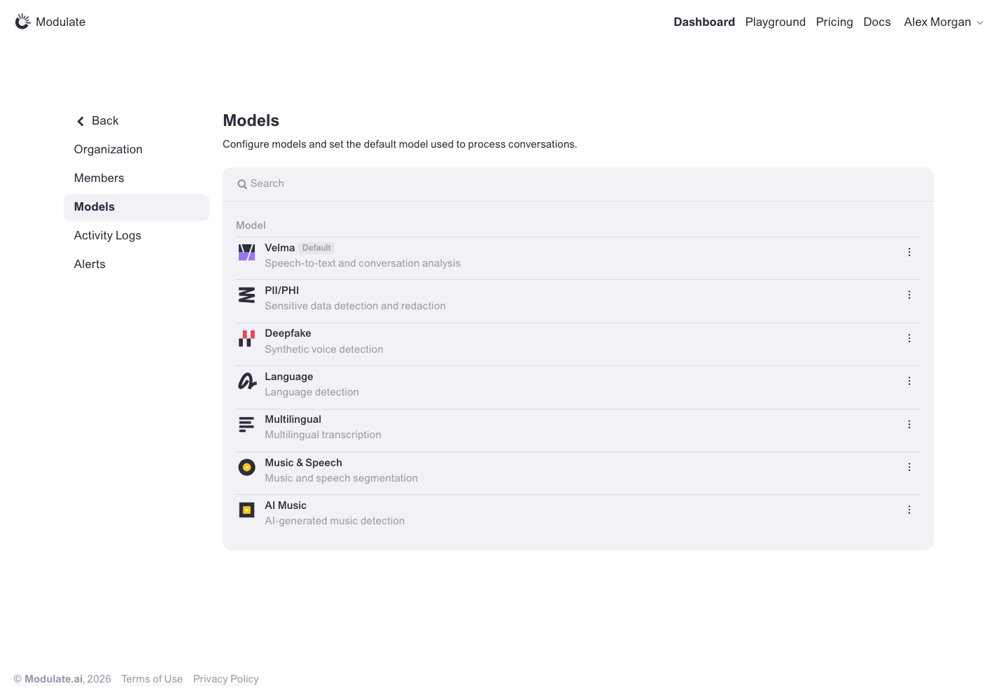 Prototype changed. Capture again to compare. — | |
Usage | 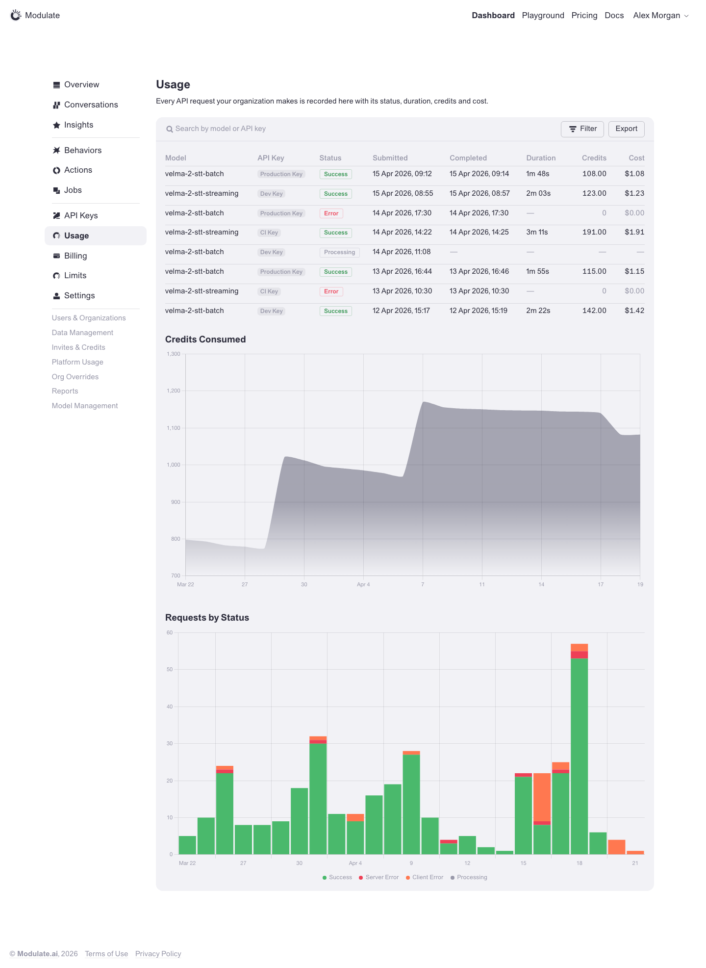 Prototype changed. Capture again to compare. 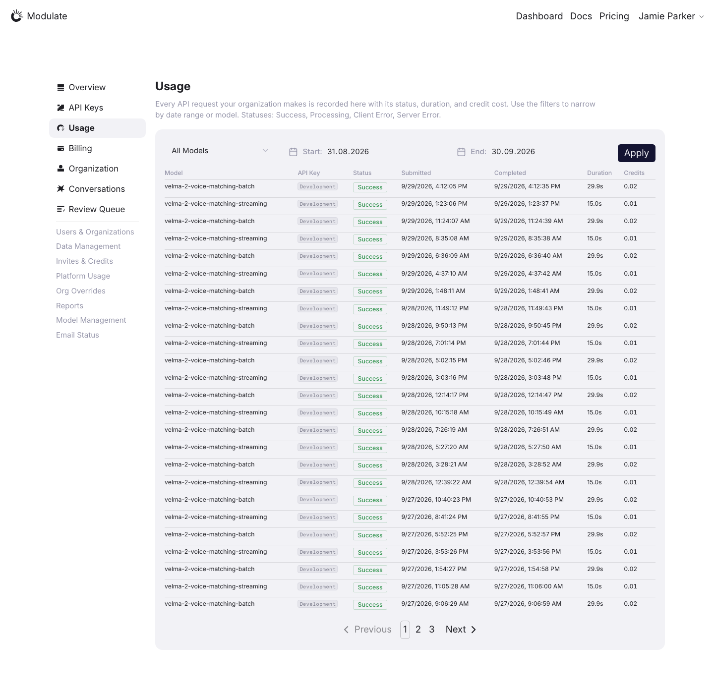
Linked issuesView data diffRequest counts, selected periods, models and pagination depend on data. Captured 1 October 2026 with field replacement before rendering; names, emails, API key names and timestamps use synthetic values. Credit balances and amounts are shown unchanged. | |
Limits | 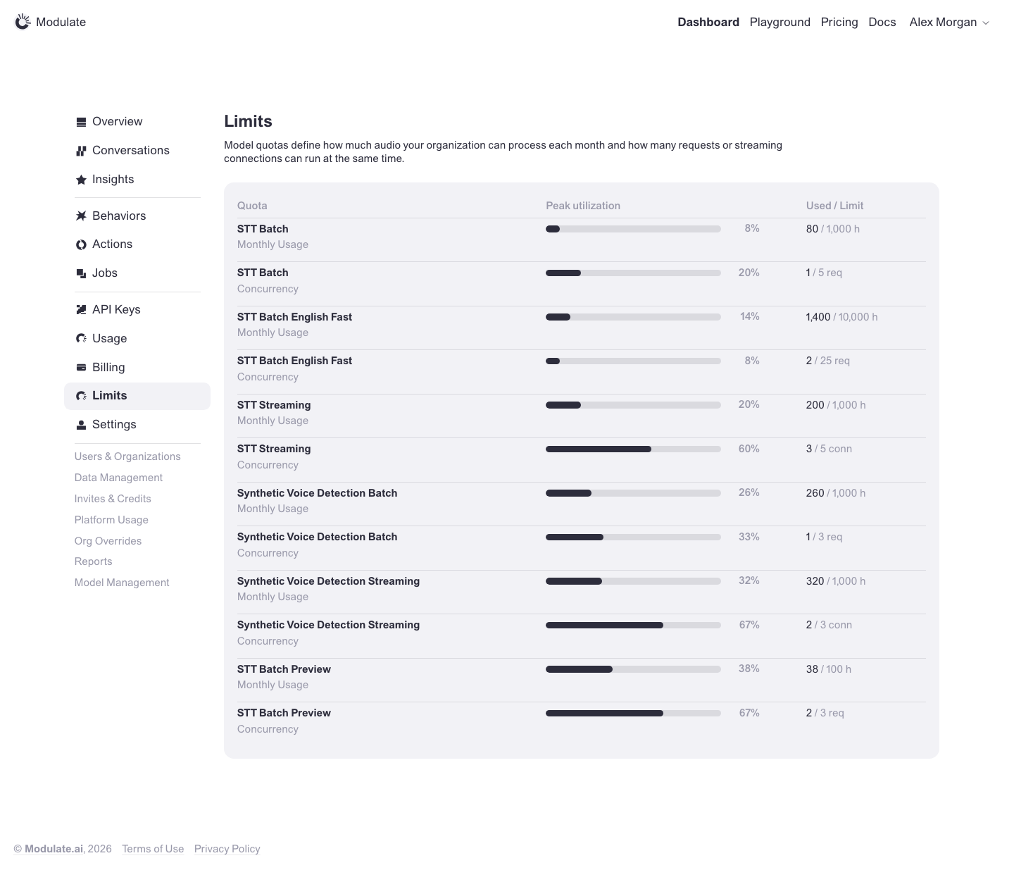 Prototype changed. Capture again to compare. — | |
Behaviors: Detection Packages | 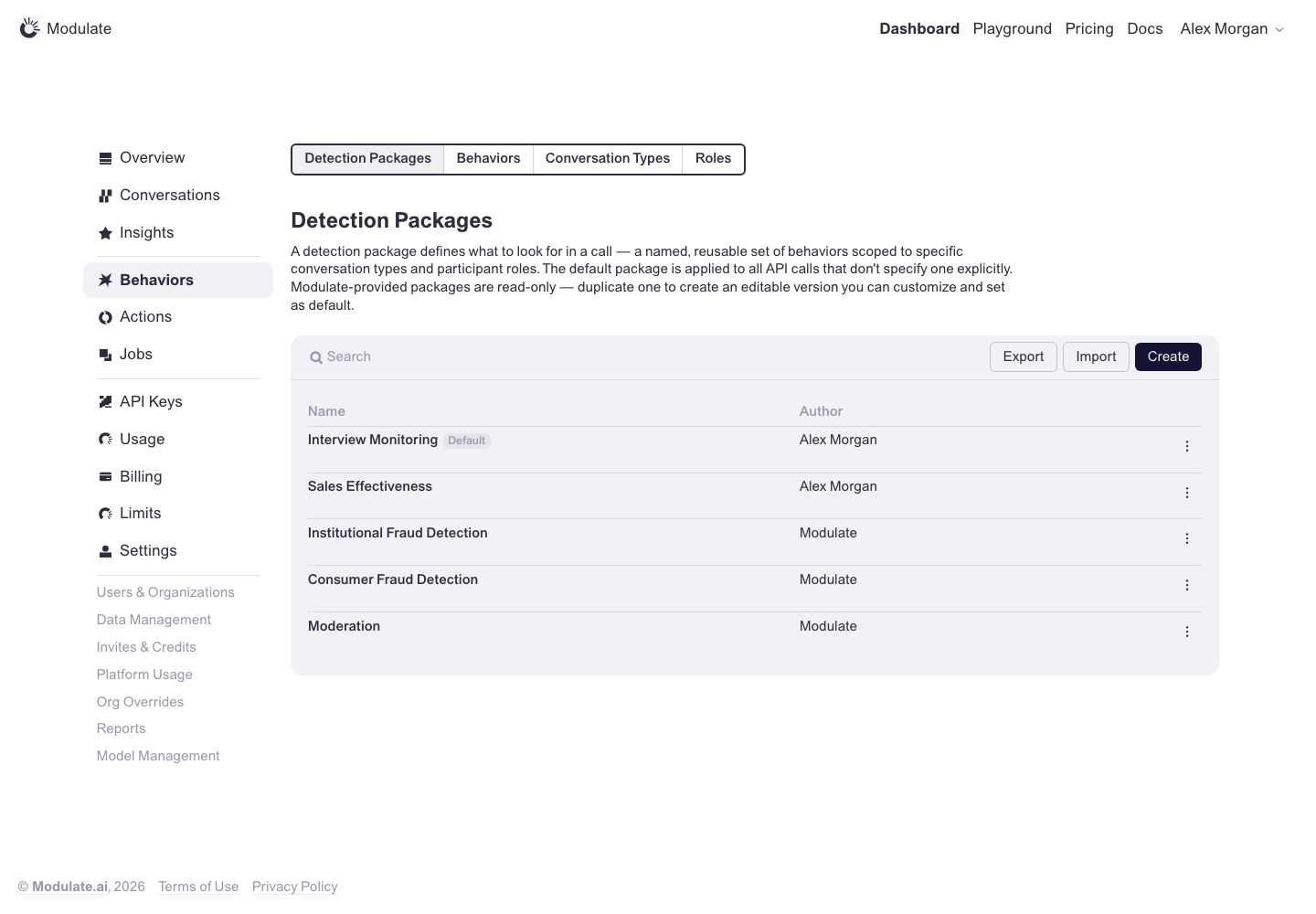 Prototype changed. Capture again to compare. — | |
Behaviors: Behaviors | 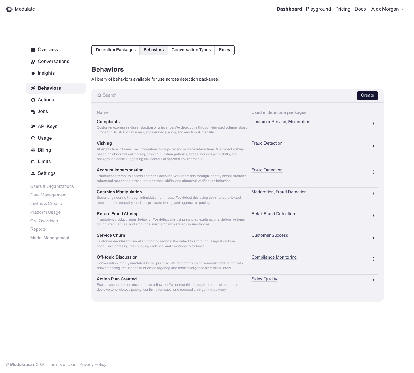 Prototype changed. Capture again to compare. — | |
Behaviors: Conversation Types | 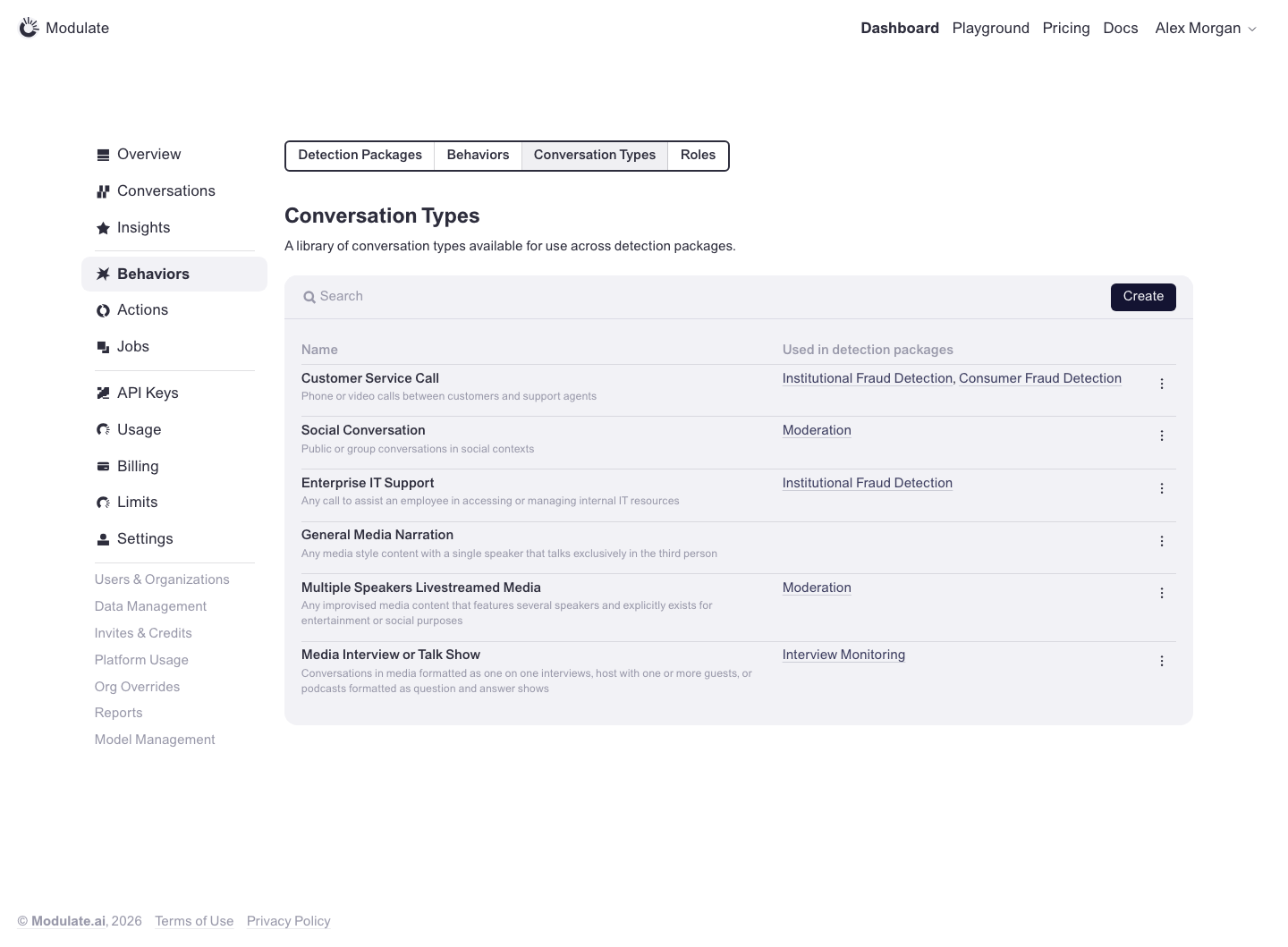 Prototype changed. Capture again to compare. — | |
Behaviors: Roles | 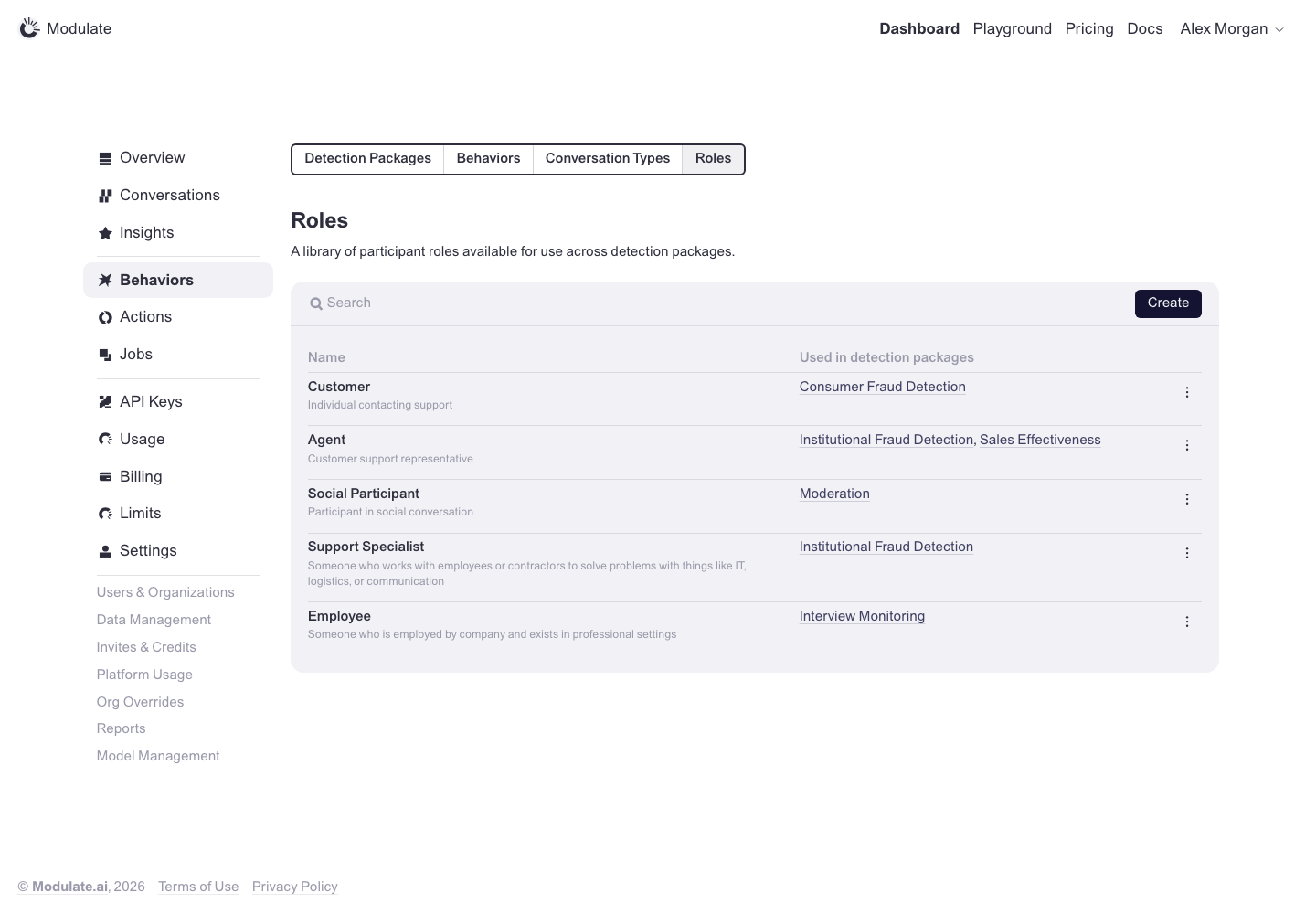 Prototype changed. Capture again to compare. — | |
Detection Package: Create | 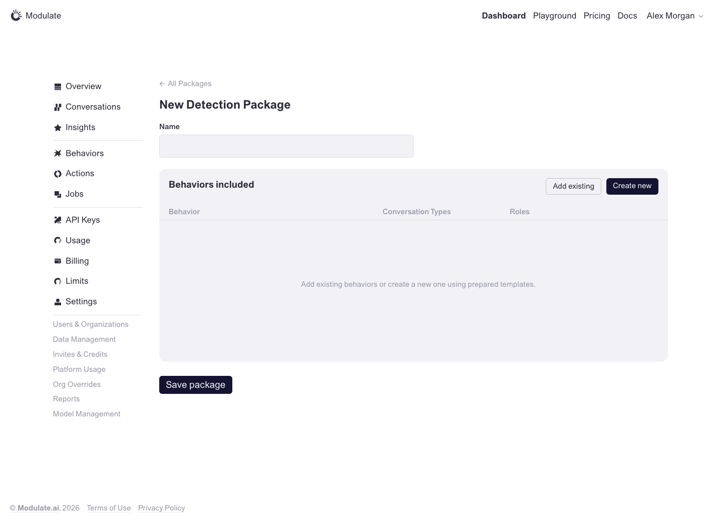 Prototype changed. Capture again to compare. — | |
Detection Package: Edit | 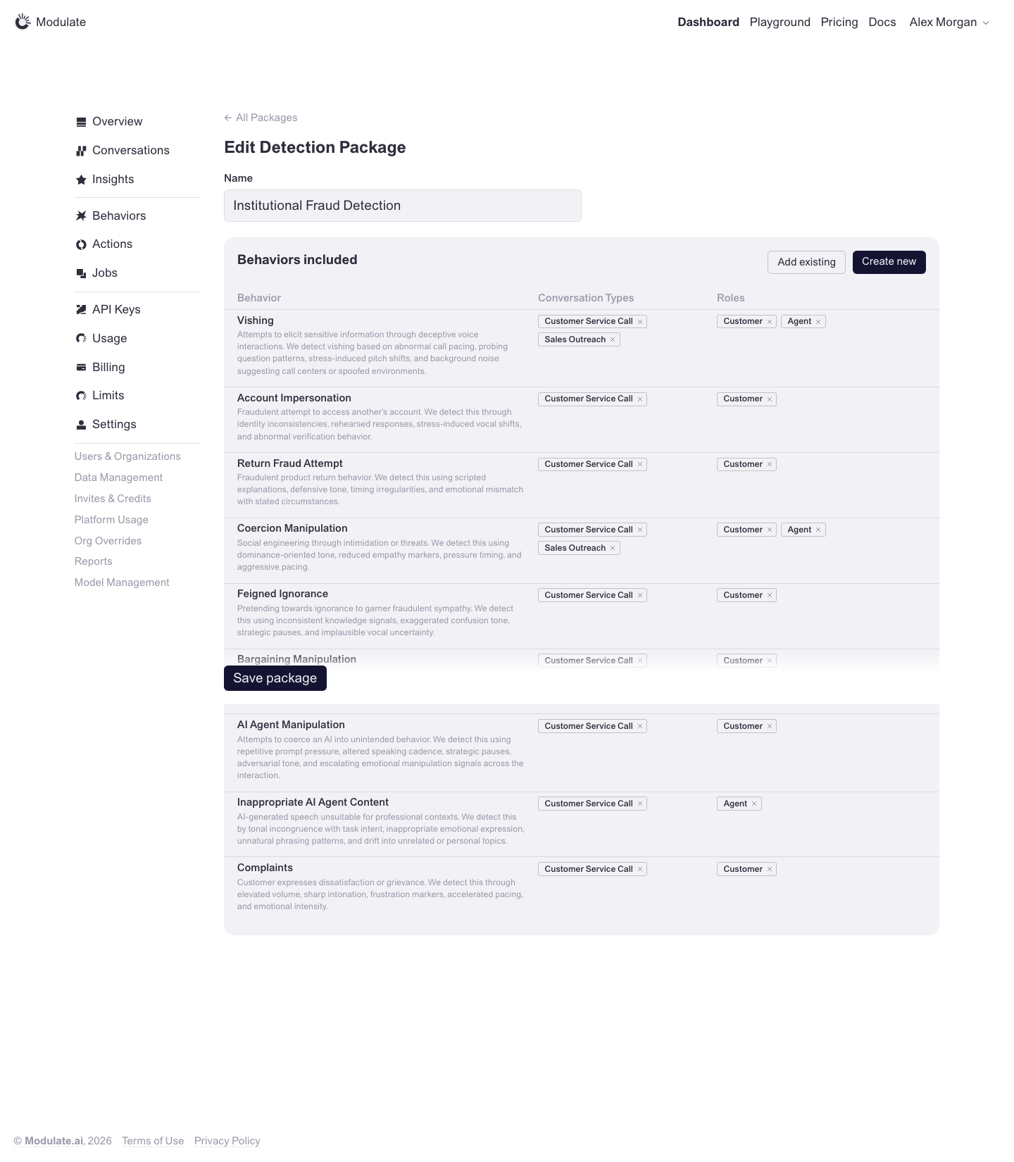 Prototype changed. Capture again to compare. — | |
Actions | 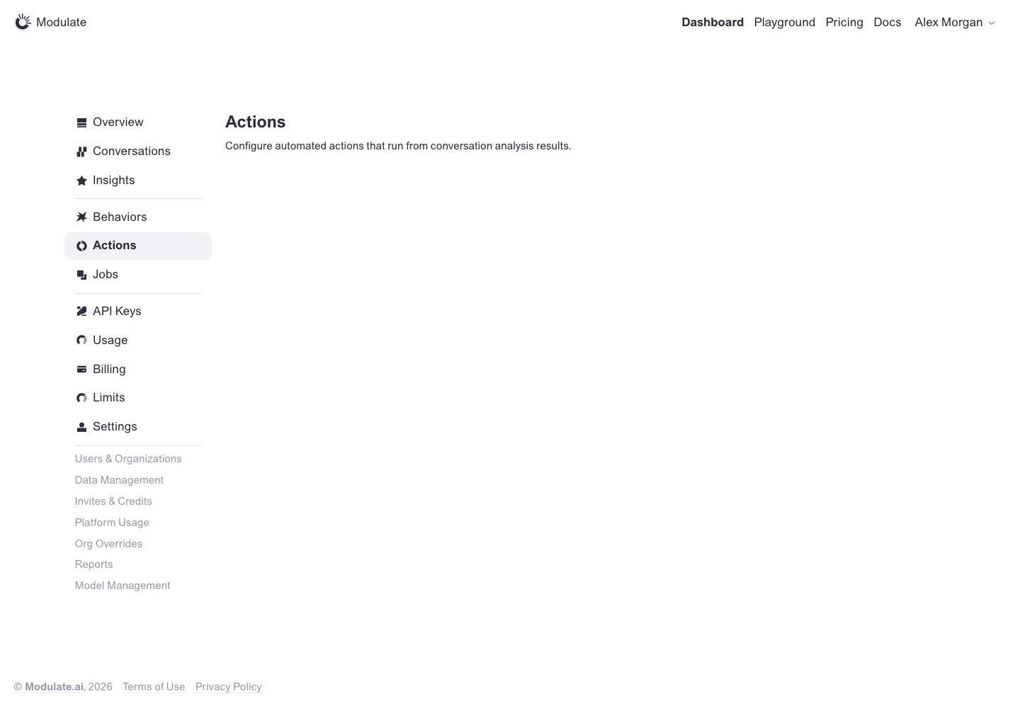 Prototype changed. Capture again to compare. — | |
Jobs | 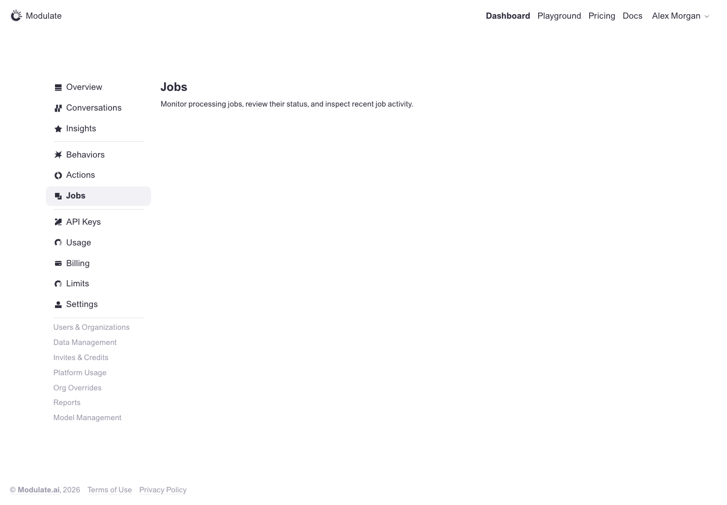 Prototype changed. Capture again to compare. — | |
Billing: Overview | 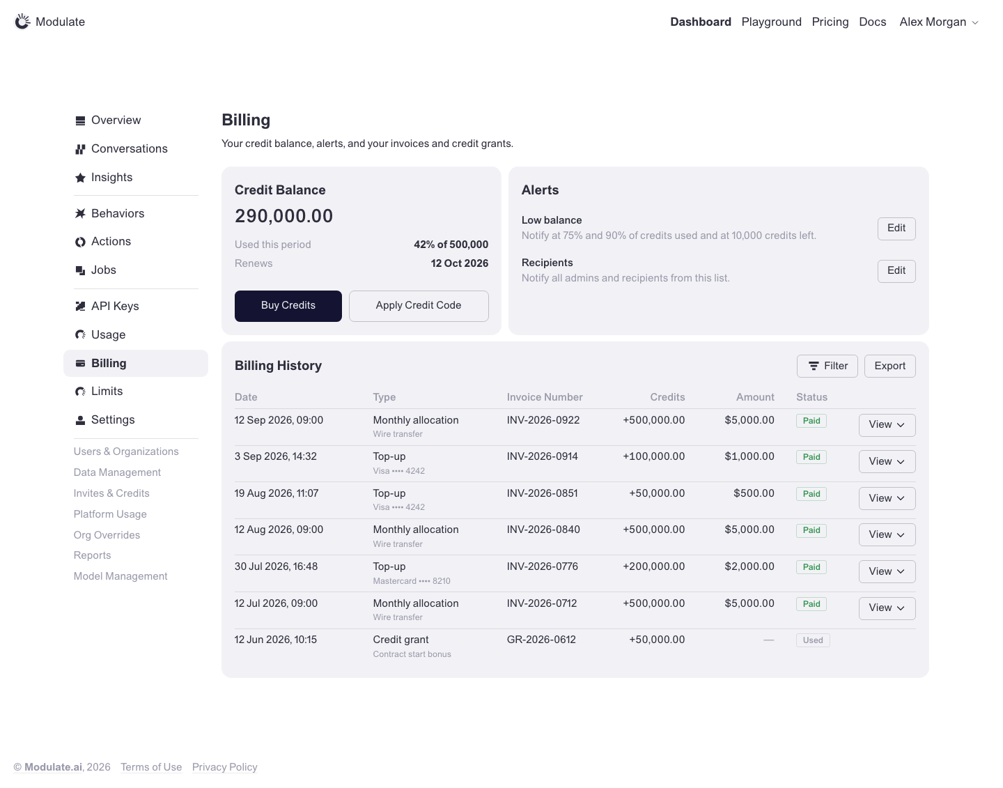 Prototype changed. Capture again to compare. 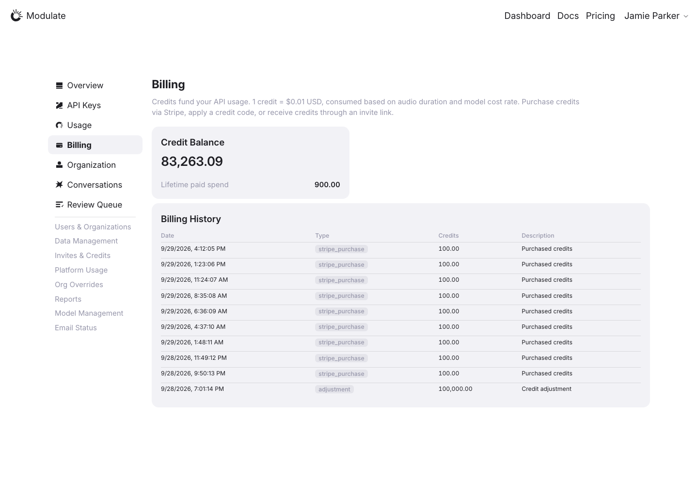
Linked issuesView data diffPrototype default state: Contracting customer, admin role, no banner. Auto Top-Up (Pay/Go only) and the usage banners are other prototype states and are not compared here. Purchase actions are absent from the production capture. Verify availability for the same role and organization type before requesting them. Transactions and balances reflect live data. Captured 1 October 2026 with field replacement before rendering; names, emails, API key names and timestamps use synthetic values. Credit balances and amounts are shown unchanged. | |
Account | 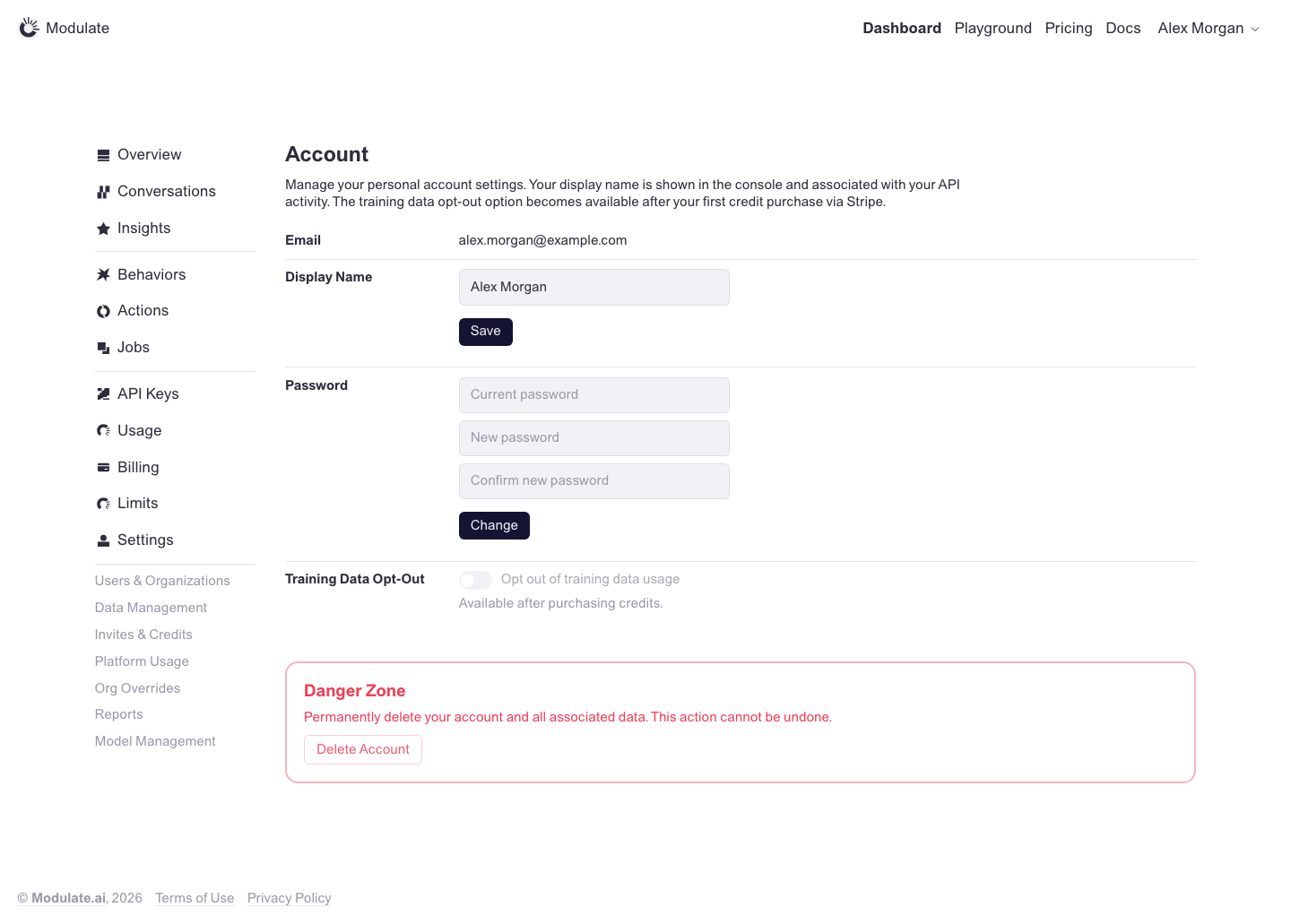 Prototype changed. Capture again to compare. 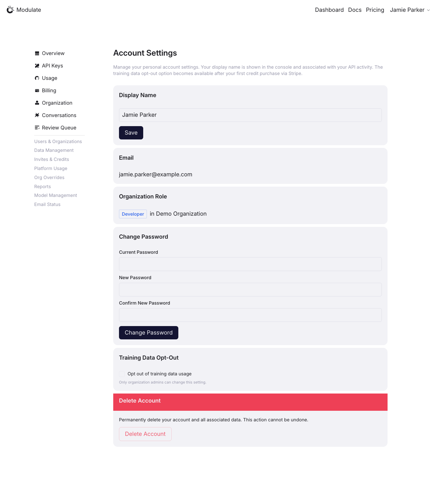
View data diffProduction shows a Developer role and disables training opt-out with an admin-permission message. The prototype explains availability after purchasing credits. These are different access states. Captured 30 September 2026 with field replacement before rendering; names, emails, organizations, IDs and account values use synthetic values. | |
Organization | 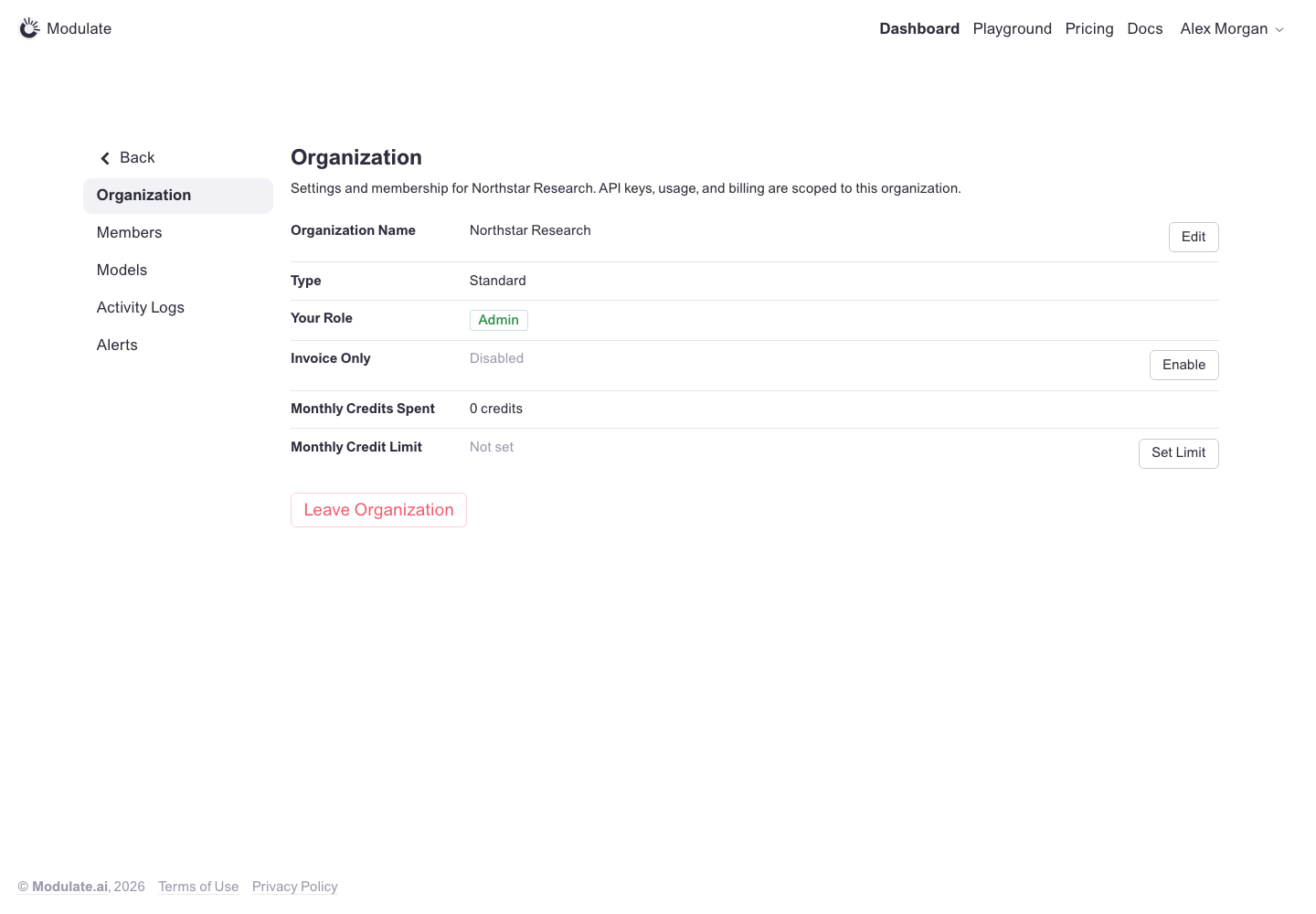 Prototype changed. Capture again to compare. 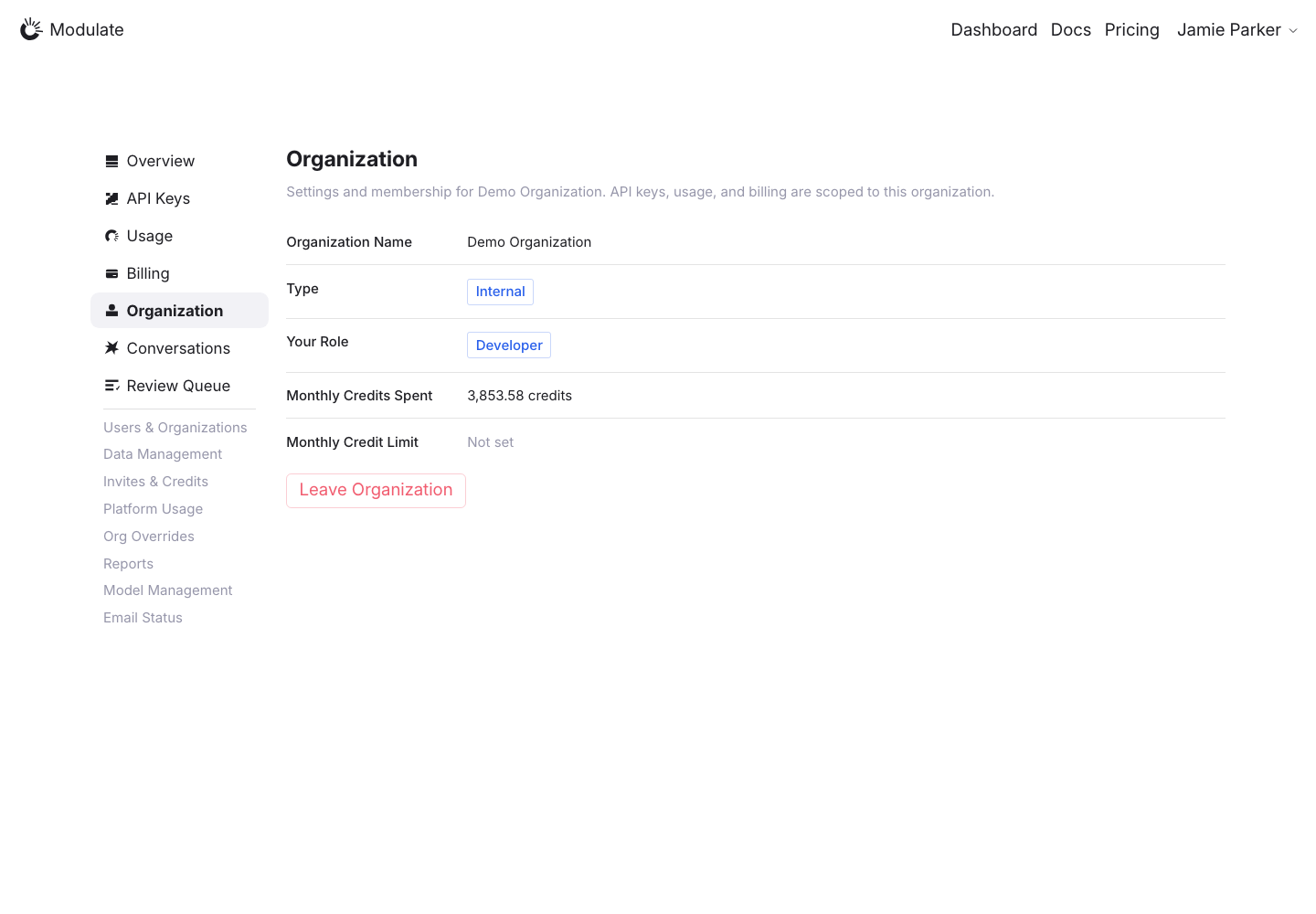
Linked issuesView data diffInvoice Only and Edit / Enable / Set Limit are absent from the capture. Production is Internal / Developer and the prototype is Standard / Admin; verify these controls with matching permissions and organization type. Captured 1 October 2026 with field replacement before rendering; names, emails, API key names and timestamps use synthetic values. Credit balances and amounts are shown unchanged. | |
Members | 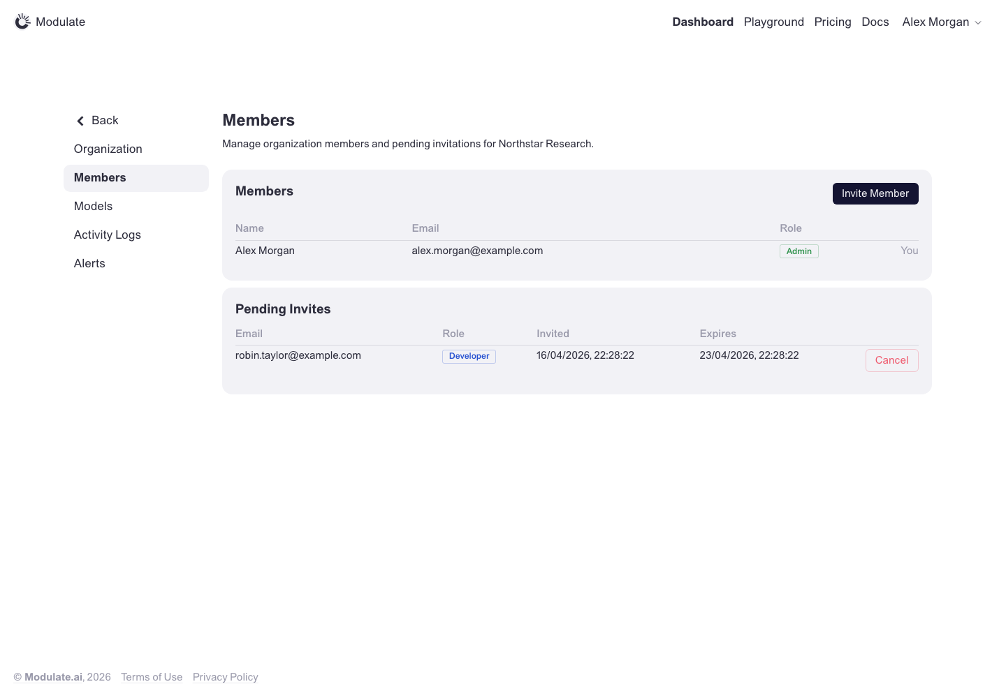 Prototype changed. Capture again to compare. — | |
Activity Logs | 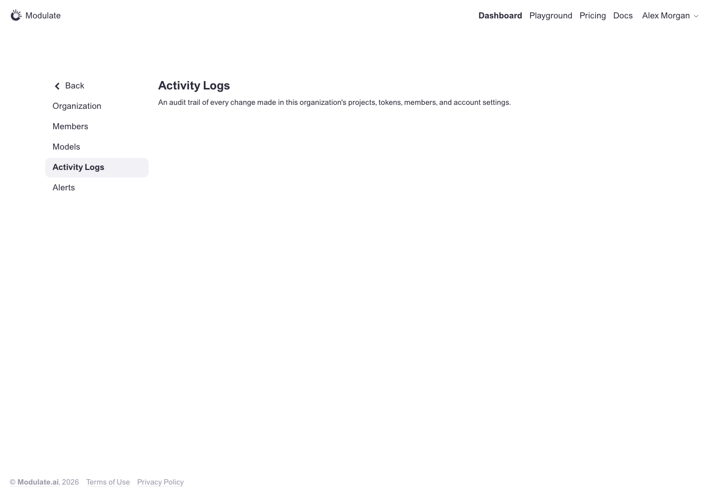 Prototype changed. Capture again to compare. — | |
Alerts | 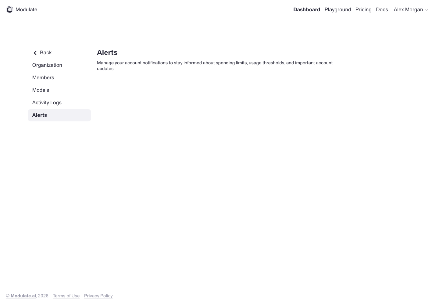 Prototype changed. Capture again to compare. — | |
Notifications | 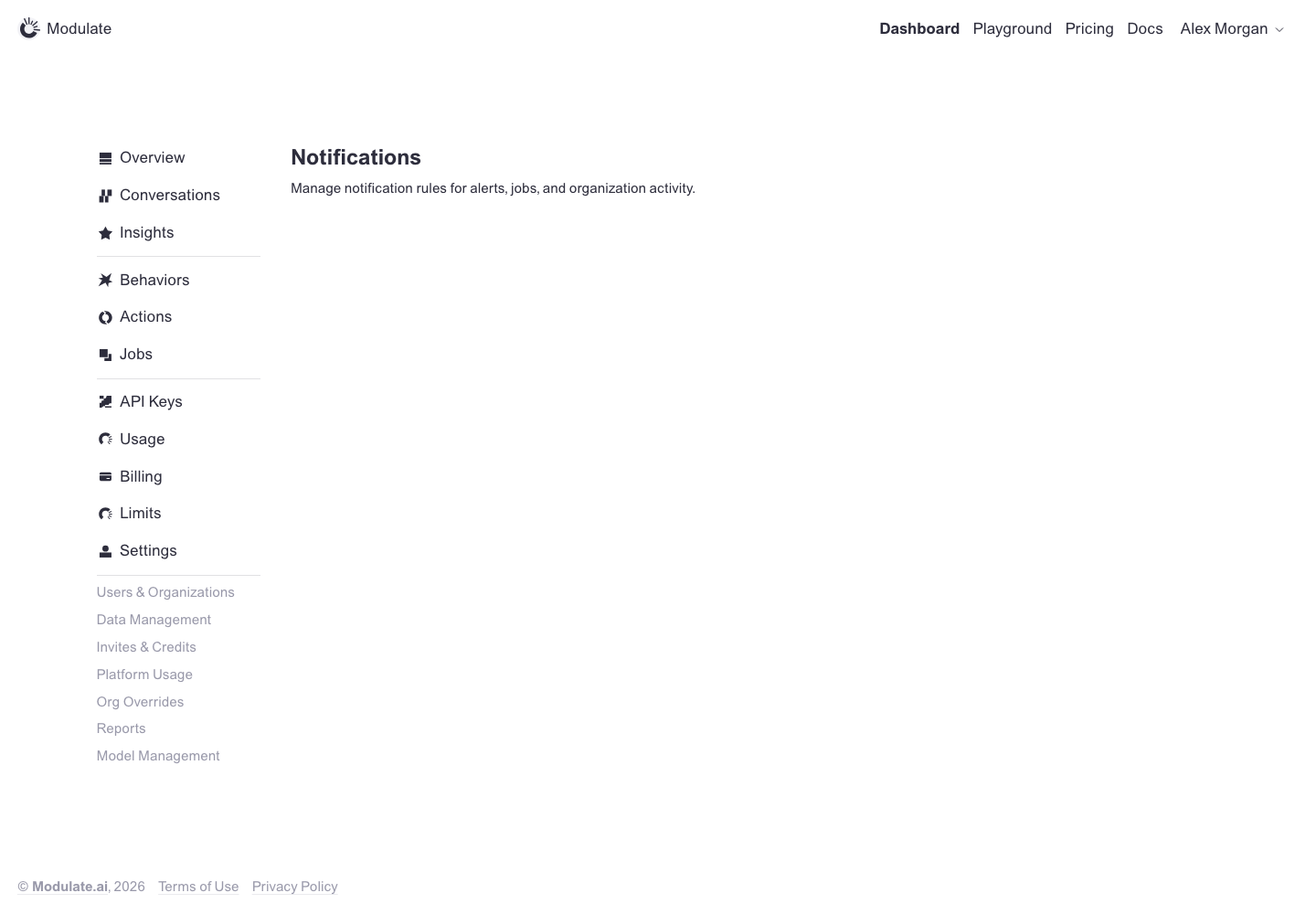 Prototype changed. Capture again to compare. — | |
Internal: Users | 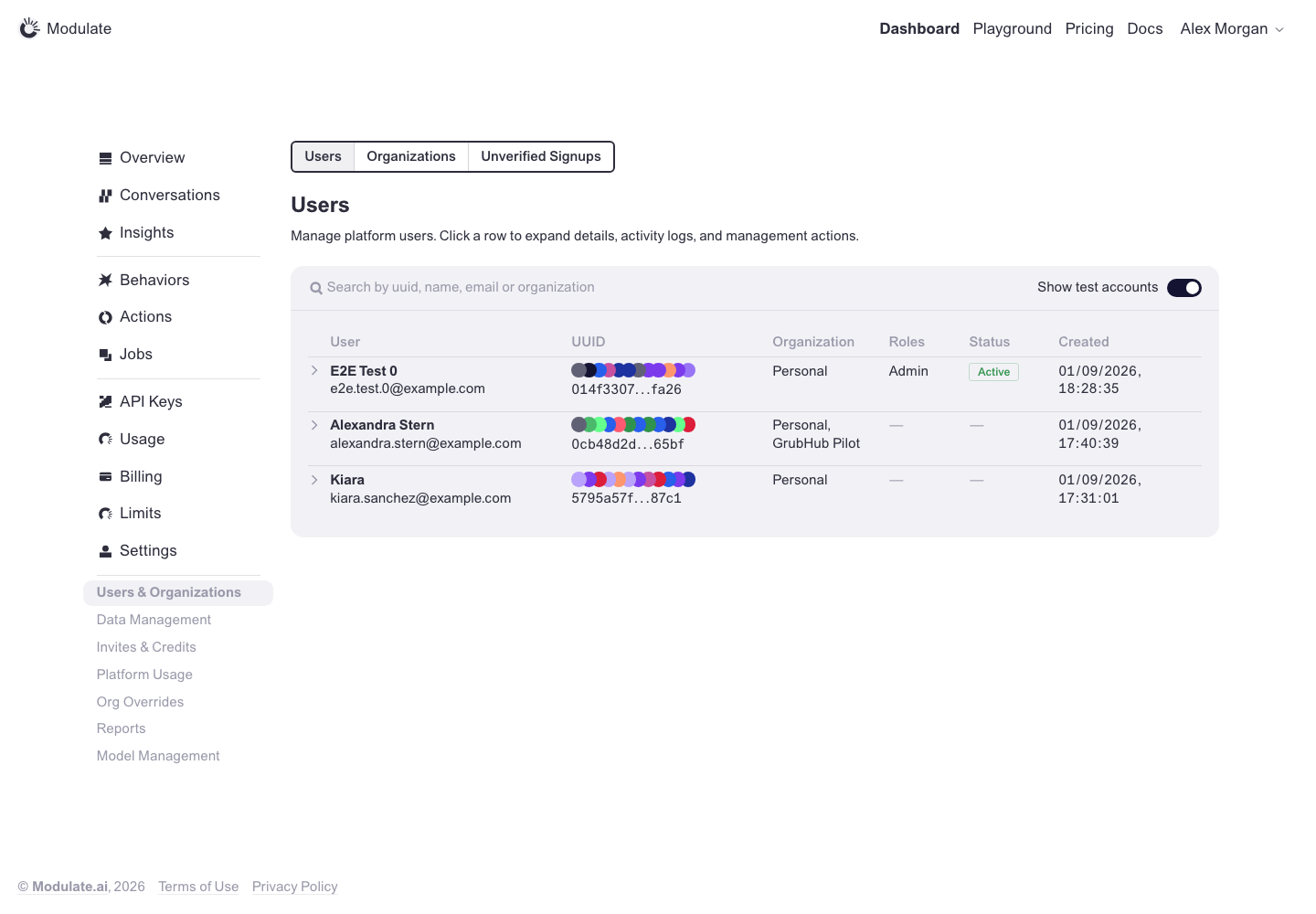 Prototype changed. Capture again to compare. 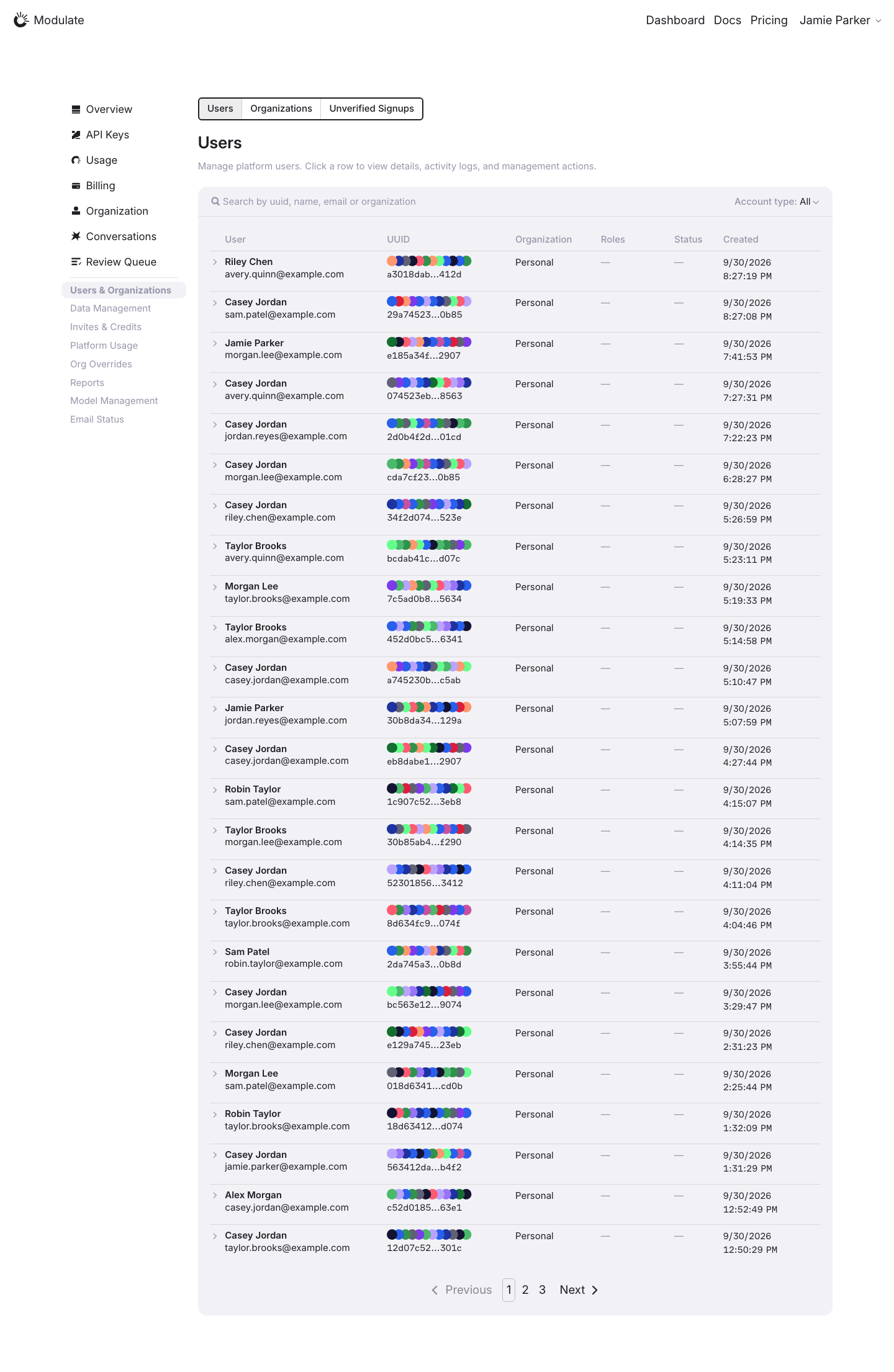
Linked issuesView data diffProduction contains live records and pagination; the prototype contains a small fixture dataset. Names, record counts and values are not design defects. Row details were not opened in this comparison. Personal and confidential values are replaced with synthetic examples in the page before capture; charts and aggregate figures are shown unchanged. Compare layout and controls only; replacement text and values are not design defects. | |
Internal: Organizations | 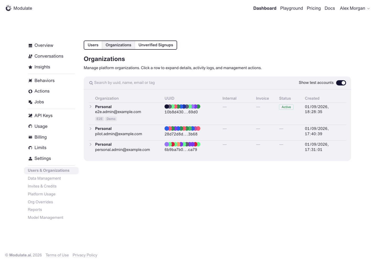 Prototype changed. Capture again to compare. 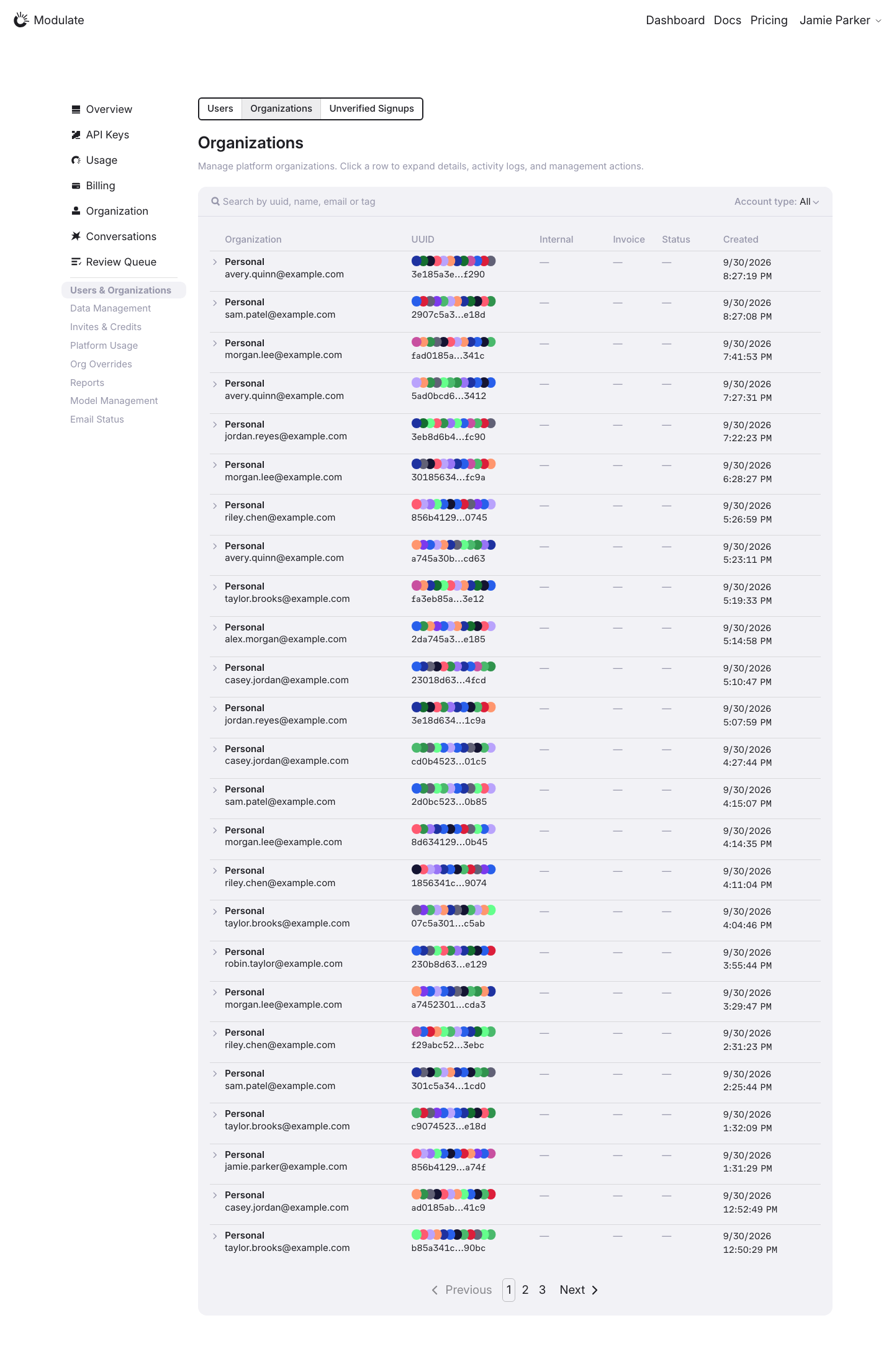
Linked issuesView data diffProduction contains live records and pagination; the prototype contains a small fixture dataset. Names, record counts and values are not design defects. Row details were not opened in this comparison. Personal and confidential values are replaced with synthetic examples in the page before capture; charts and aggregate figures are shown unchanged. Compare layout and controls only; replacement text and values are not design defects. | |
Internal: Unverified Signups | 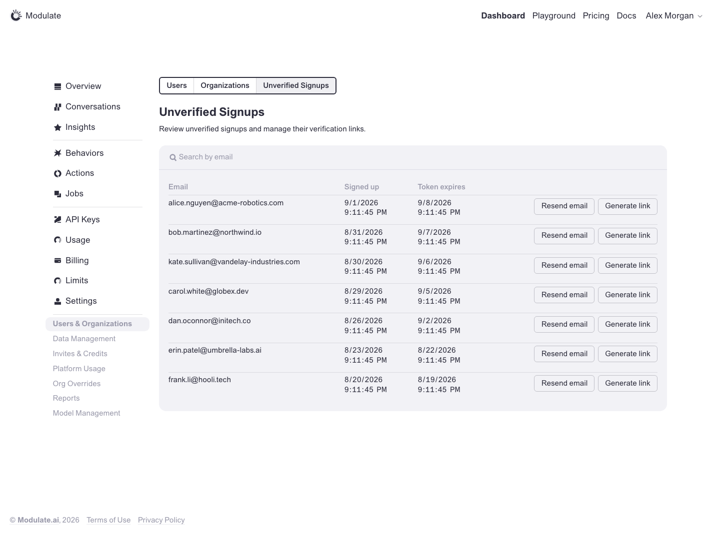 Prototype changed. Capture again to compare. 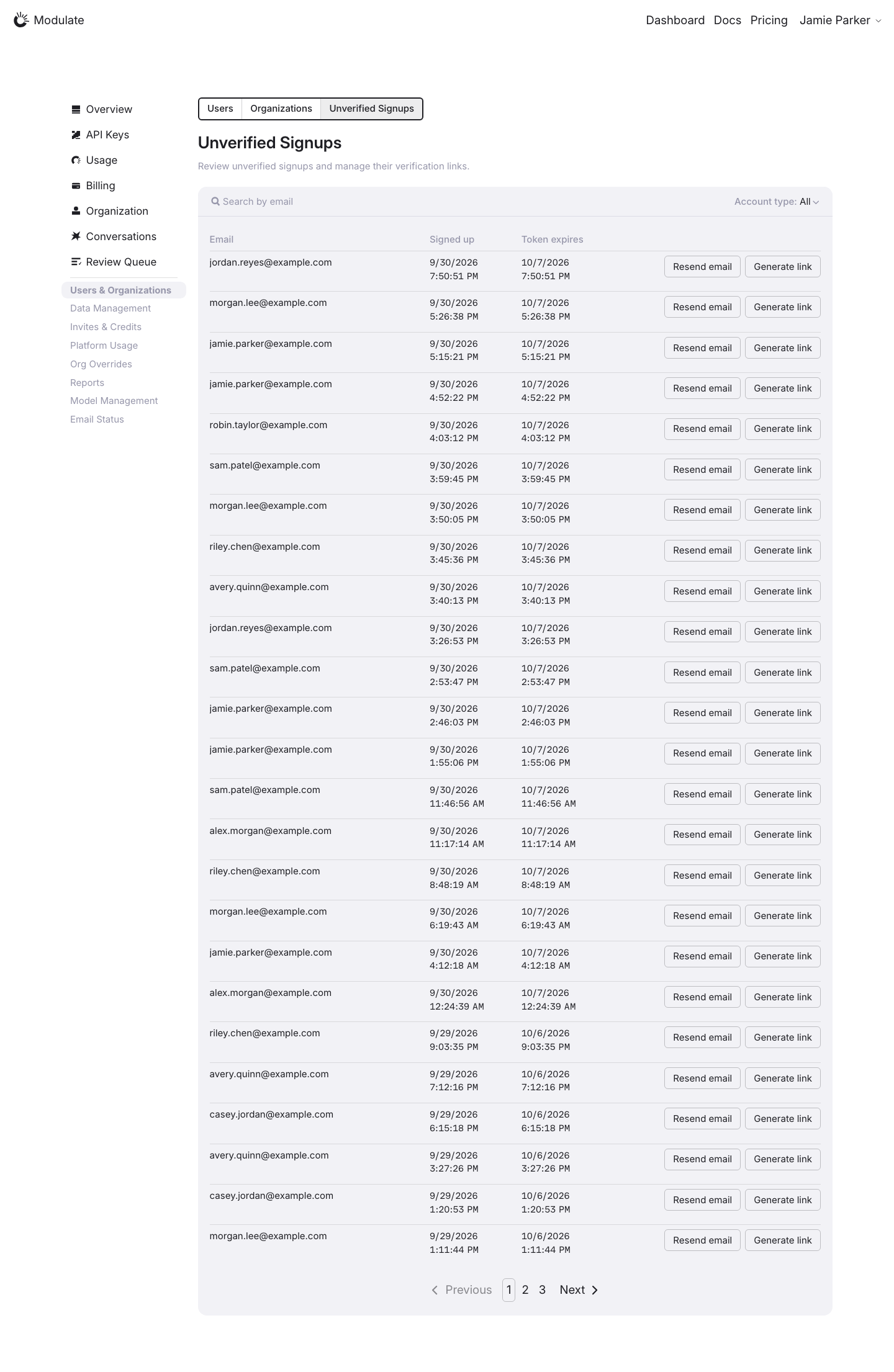
Linked issuesView data diffProduction and prototype contain different records; counts and dates are data differences. Personal and confidential values are replaced with synthetic examples in the page before capture; charts and aggregate figures are shown unchanged. Compare layout and controls only; replacement text and values are not design defects. | |
Data Management: Export | ||
Data Management: Deletion | ||
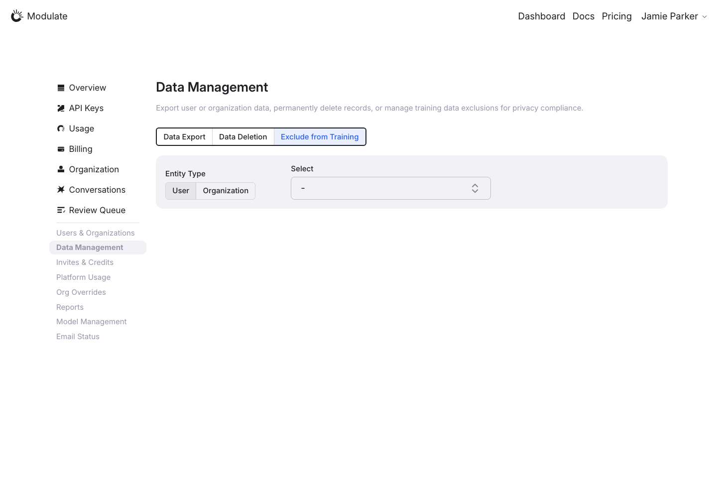
Data Management: Exclude from Training | ||
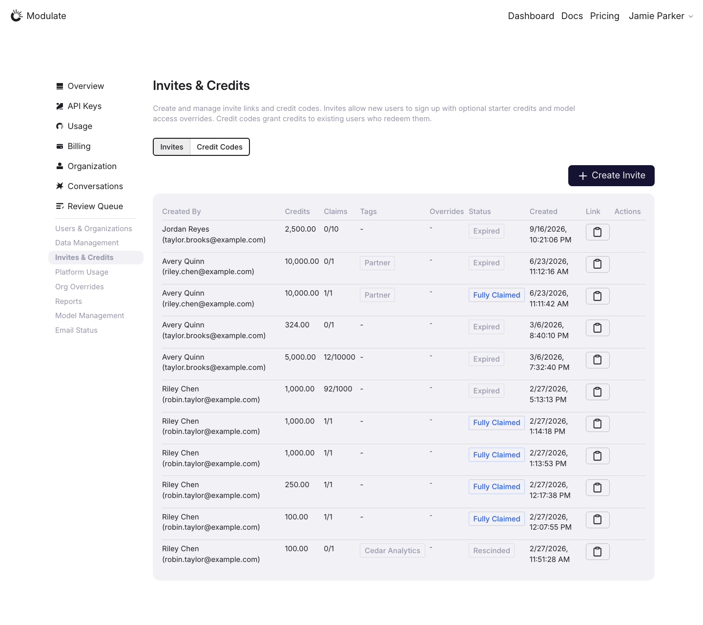
Invites & Credits: Invites | ||
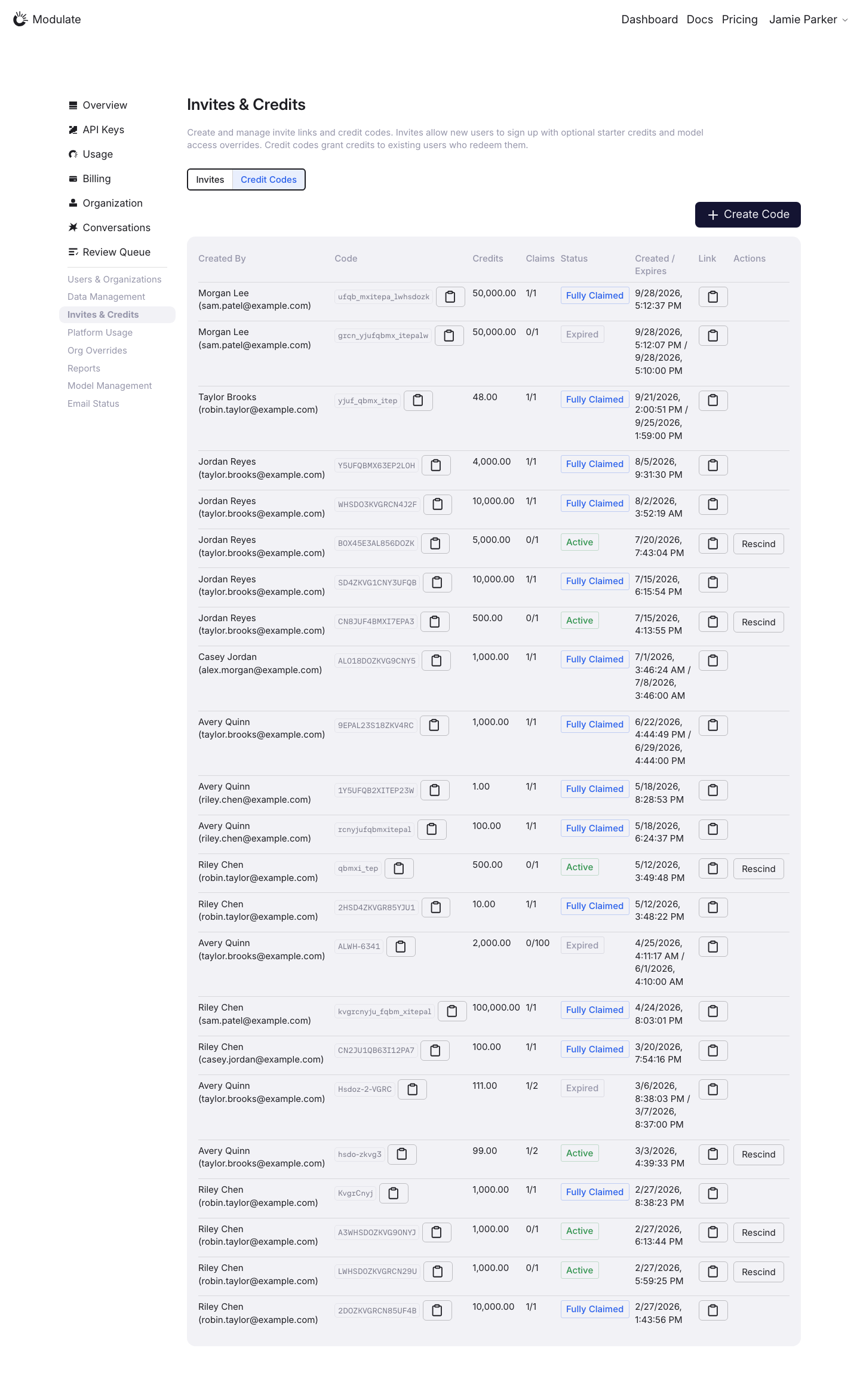
Invites & Credits: Credit Codes | ||
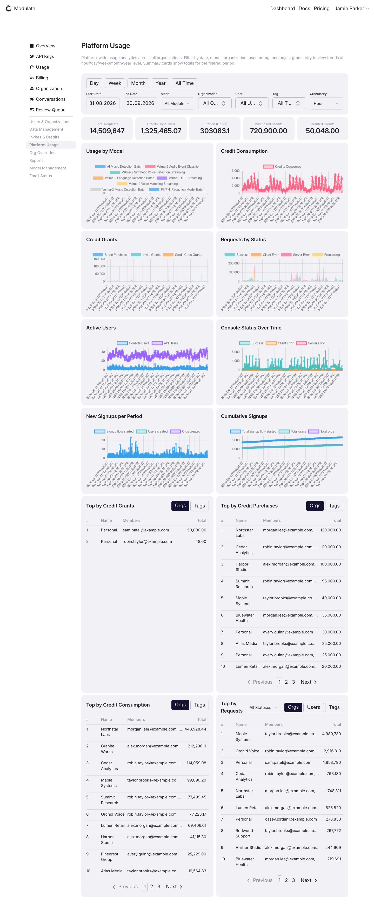
Platform Usage | ||
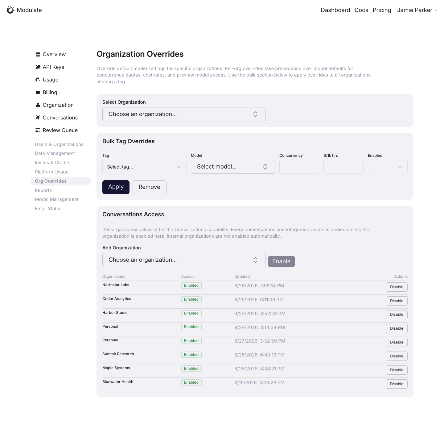
Org Overrides | ||
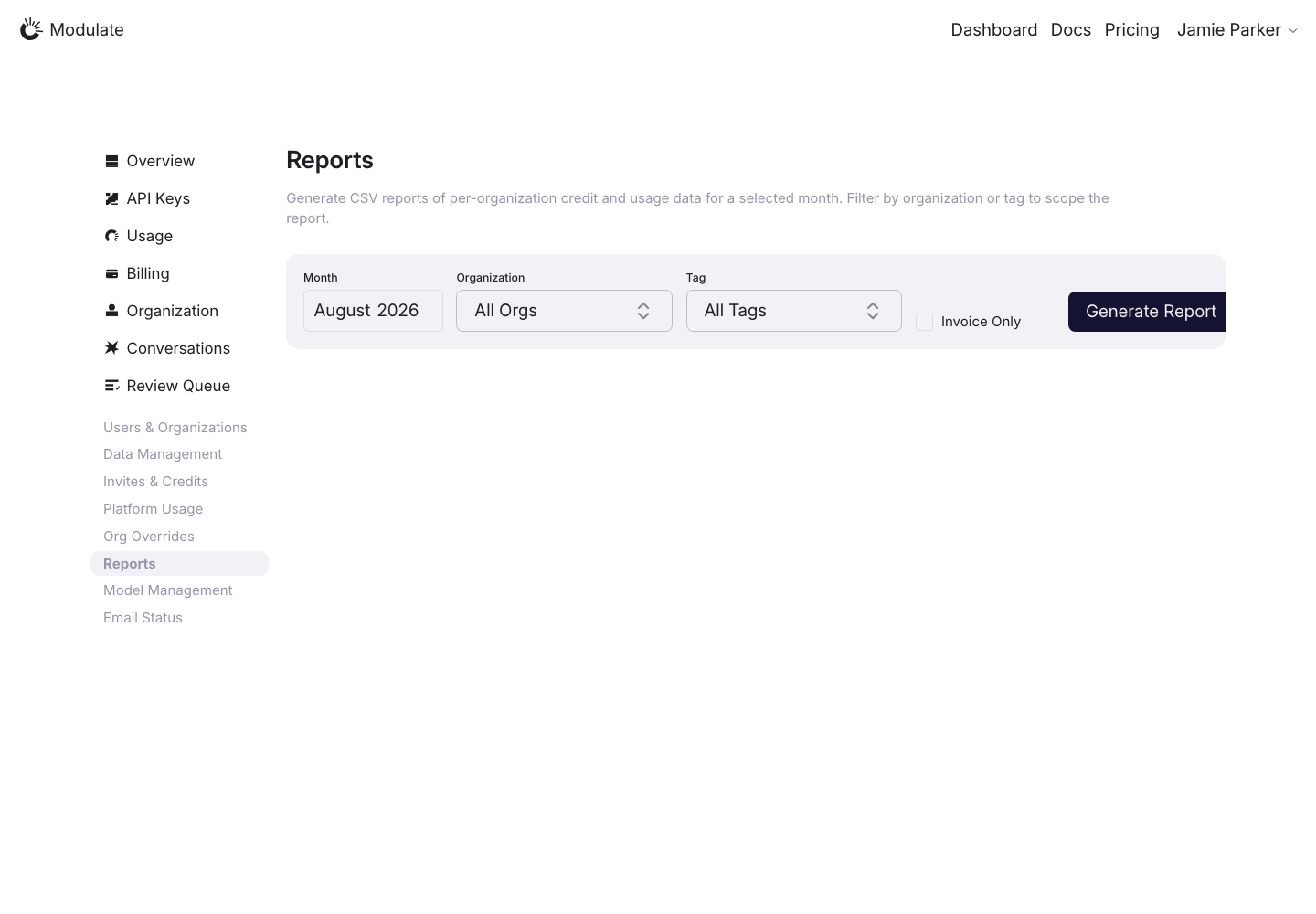
Reports | ||
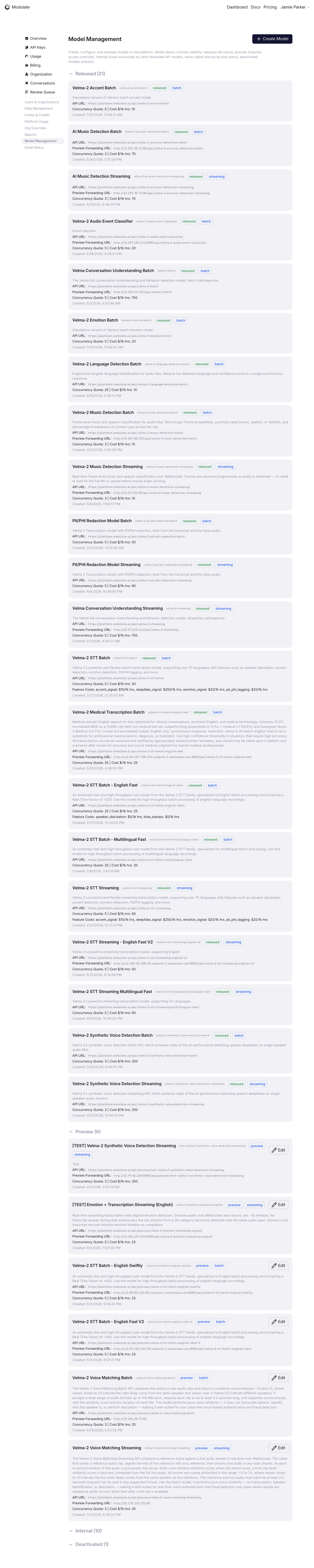
Model Management | ||
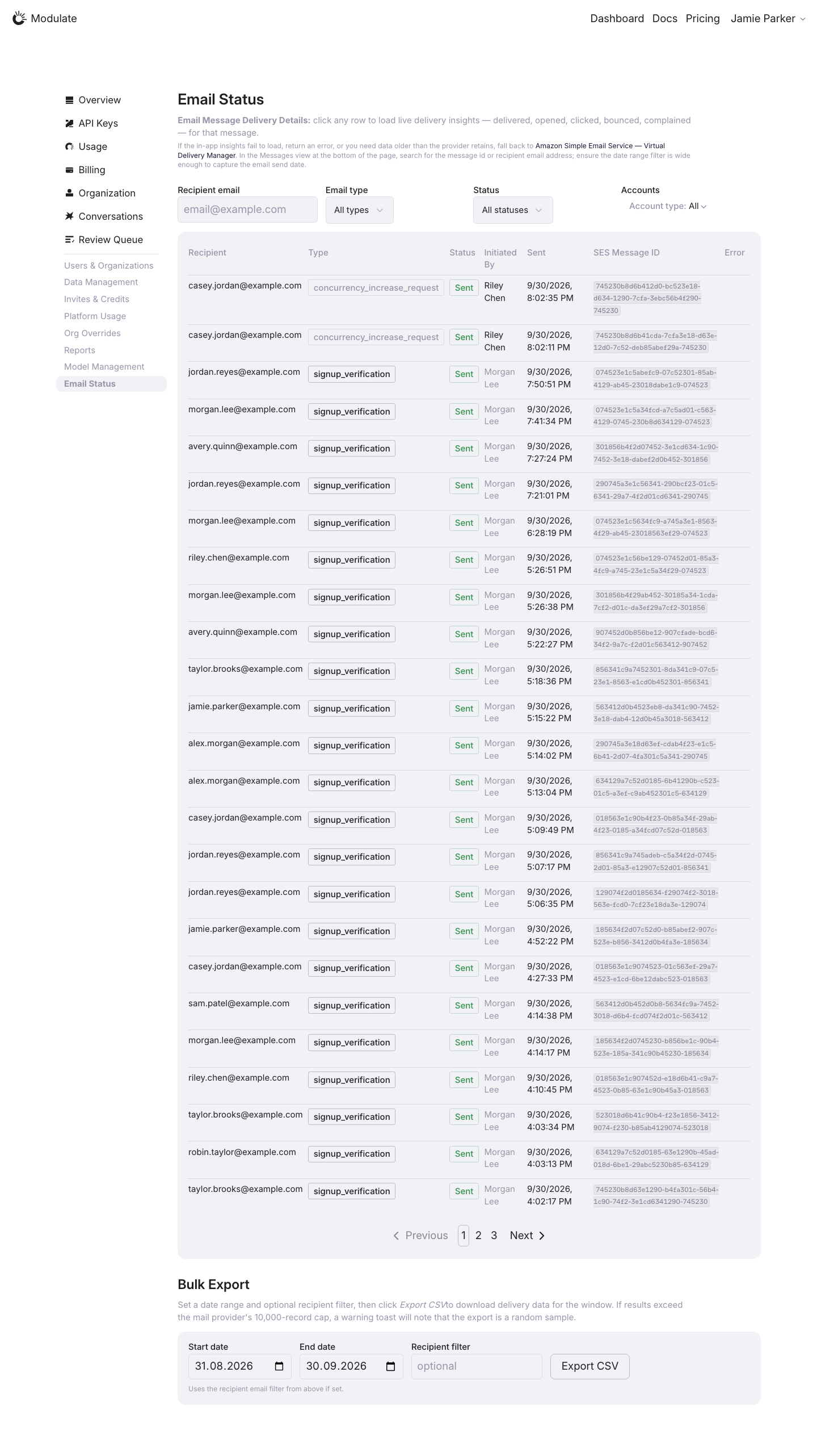
Email Status | ||
Admin APIs | — — | |
Sign in | 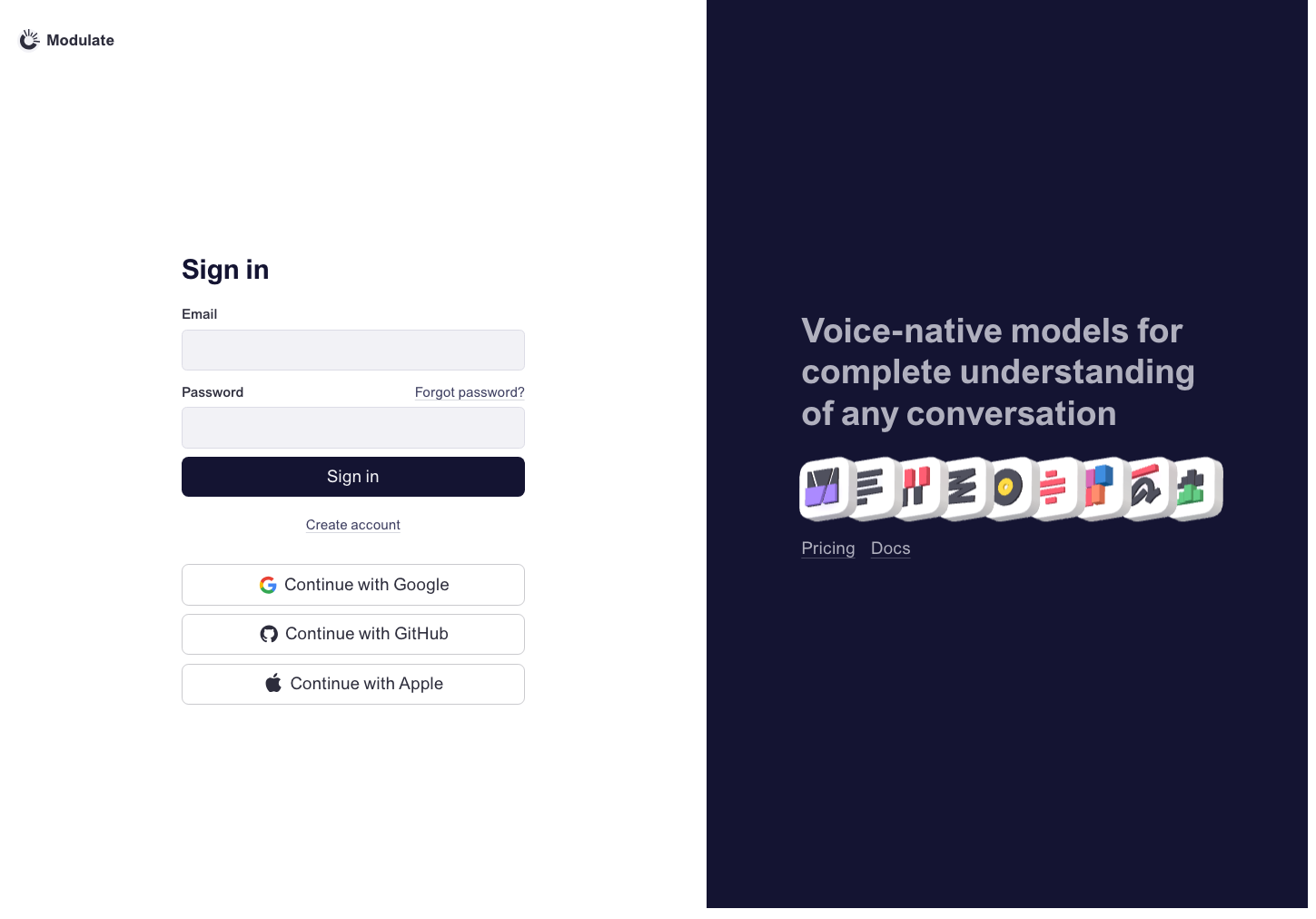 Prototype changed. Capture again to compare. 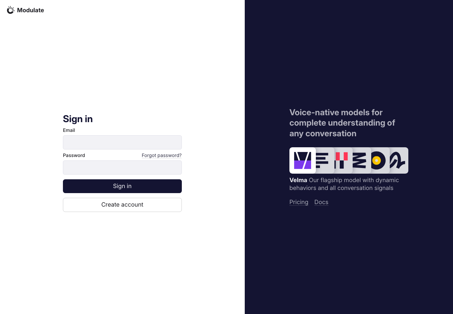
View data diffInitial form with empty fields. No credentials or personal data are included. Captured 30 September 2026 with field replacement before rendering; names, emails, organizations, IDs and account values use synthetic values. | |
Create account | 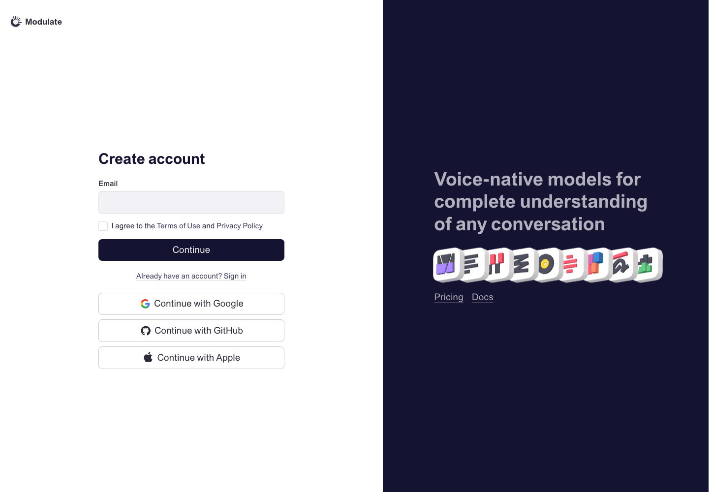 Prototype changed. Capture again to compare. 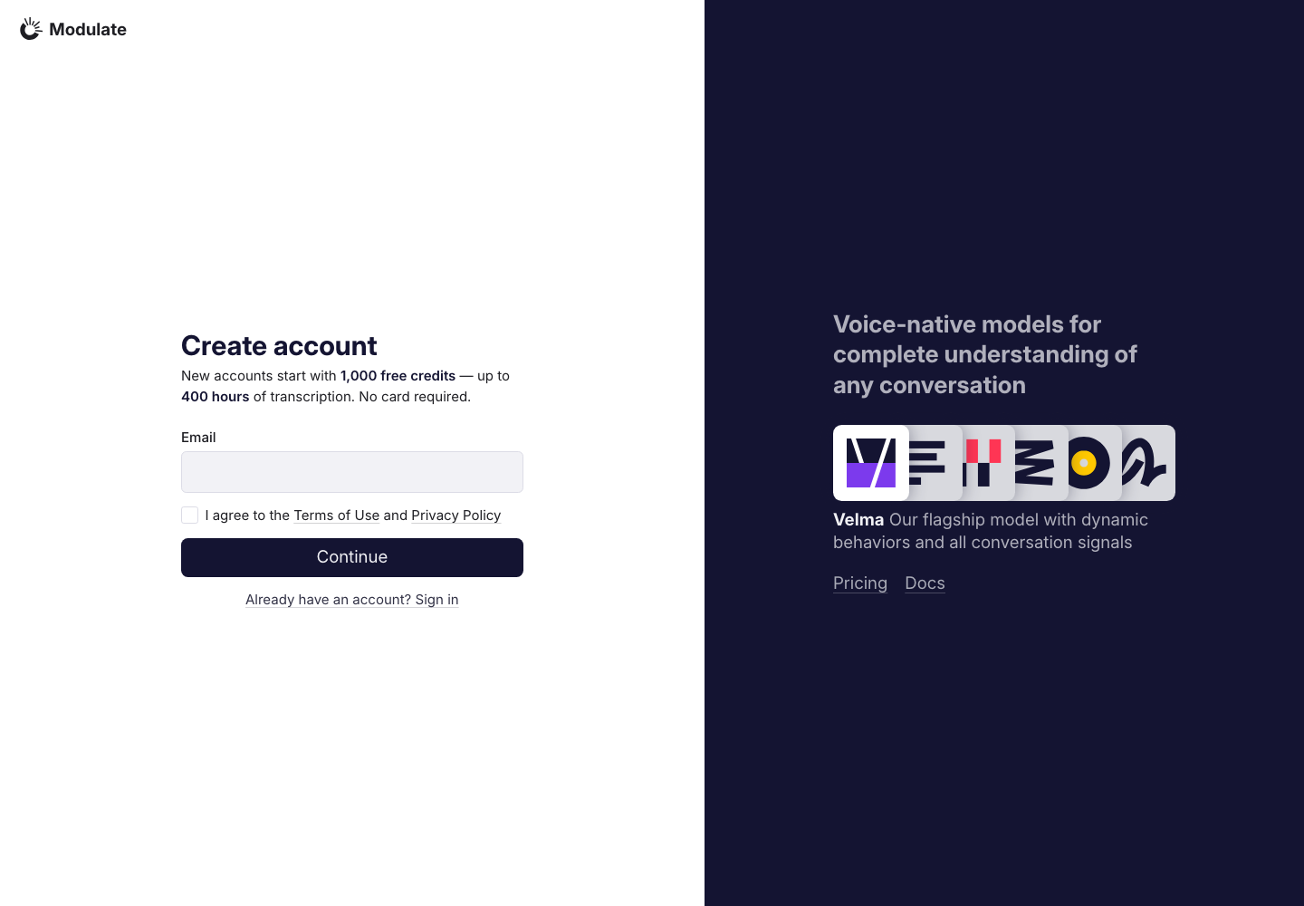
View data diffInitial form with empty fields. No credentials or personal data are included. Captured 30 September 2026 with field replacement before rendering; names, emails, organizations, IDs and account values use synthetic values. | |
Reset password | 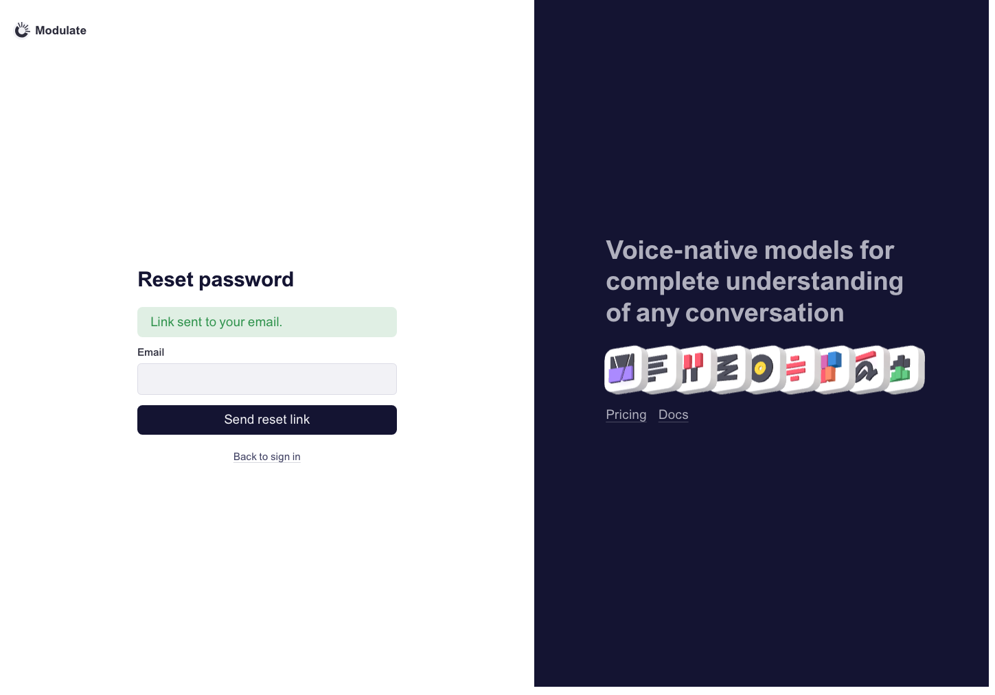 Prototype changed. Capture again to compare. 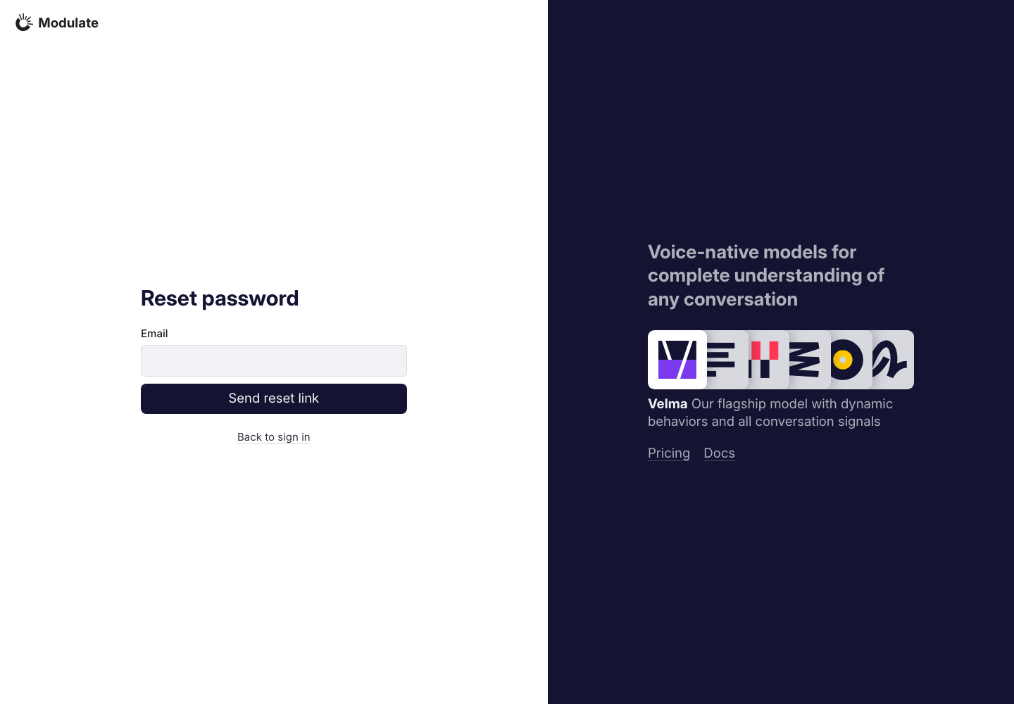
View data diffProduction shows the initial form. The prototype displays a “Link sent to your email” success notice alongside the form. These are different states; no reset email was requested. Captured 30 September 2026 with field replacement before rendering; names, emails, organizations, IDs and account values use synthetic values. | |
Set new password | 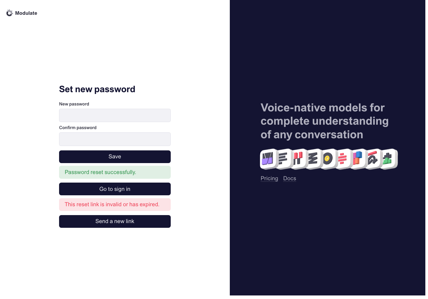 Prototype changed. Capture again to compare. — | |
Create account | 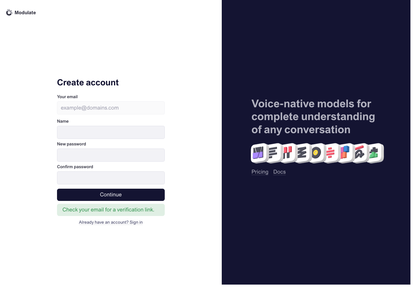 Prototype changed. Capture again to compare. — | |
Accept invite | 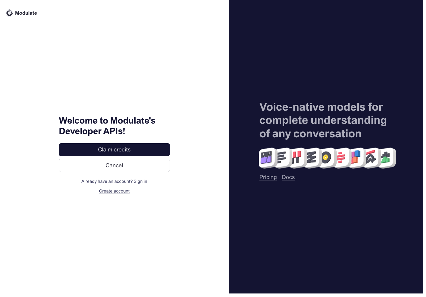 Prototype changed. Capture again to compare. — | |
Organization invite | 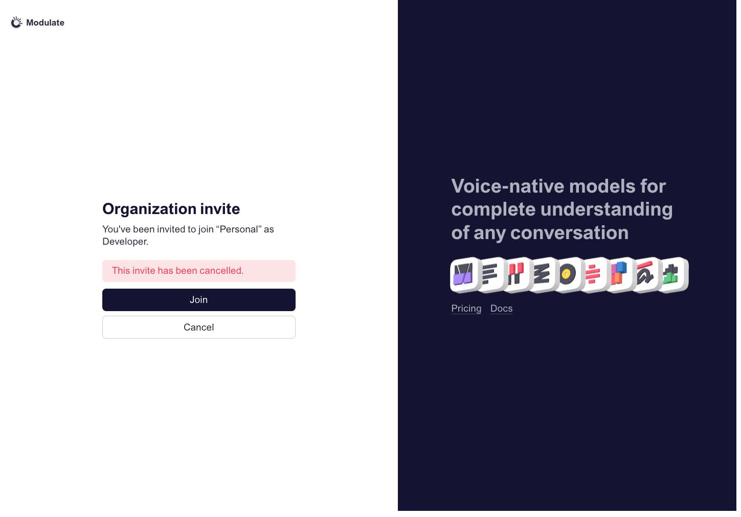 Prototype changed. Capture again to compare. — | |
Select organization | 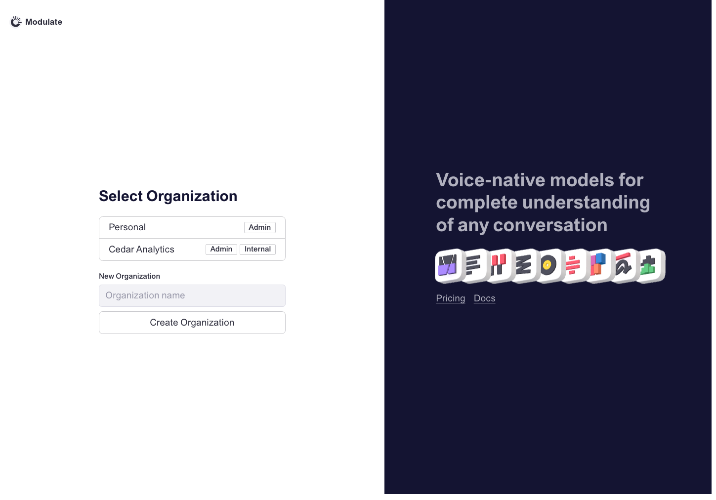 Prototype changed. Capture again to compare. 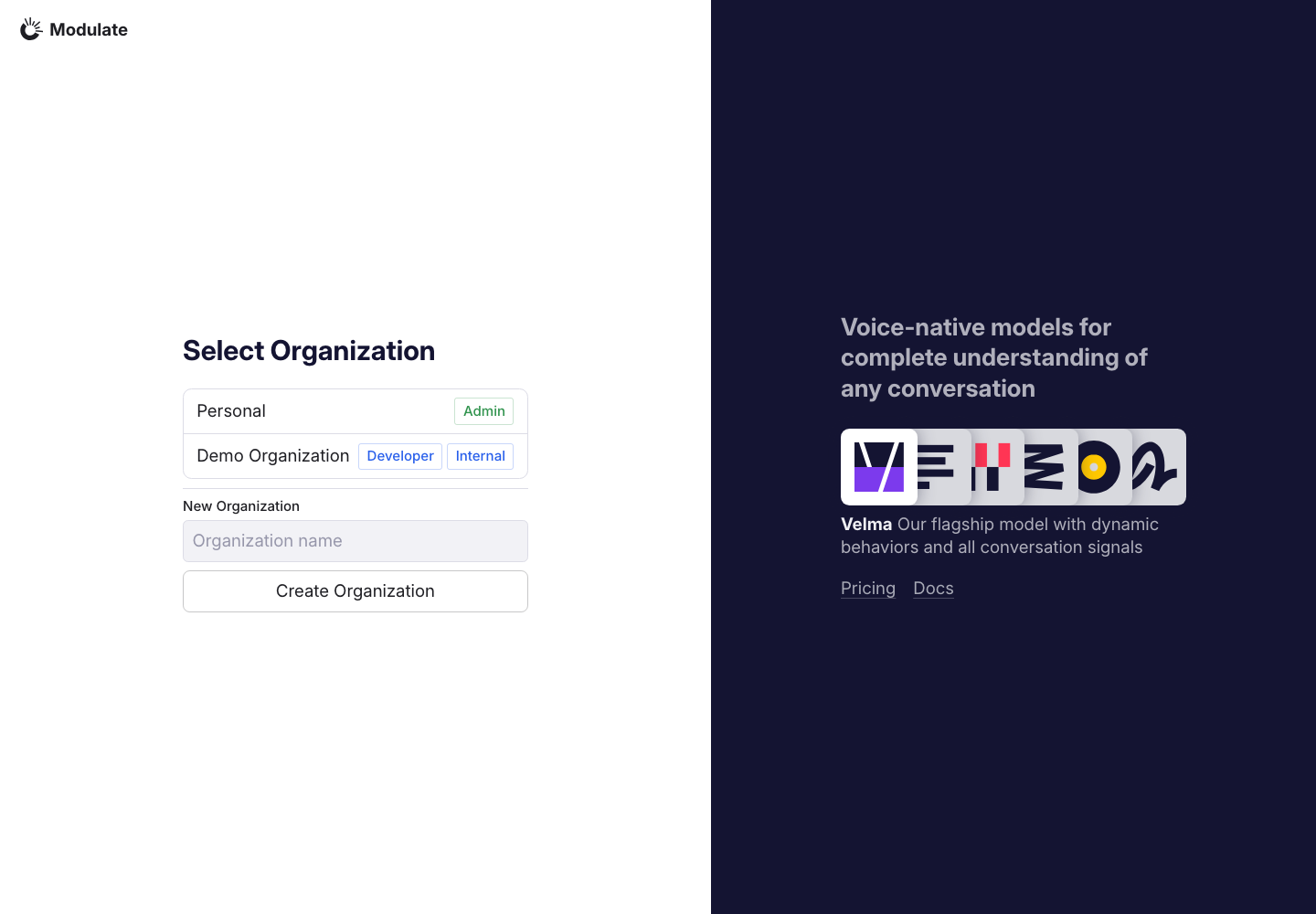
View data diffOrganization names are synthetic in both screenshots. Roles belong to different datasets and are not design defects. Captured 30 September 2026 with field replacement before rendering; names, emails, organizations, IDs and account values use synthetic values. | |
Billing: Top-up | — — | |
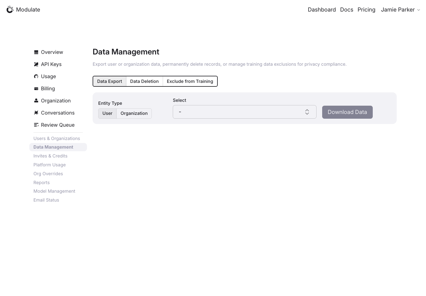
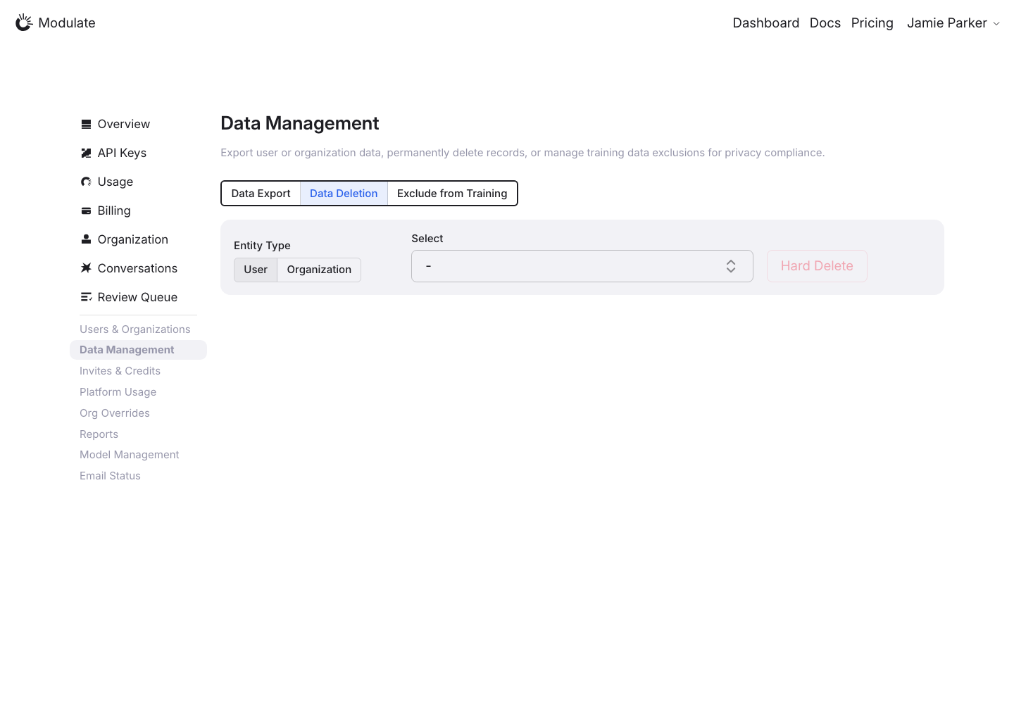
Components
| Component | Prototype | Production |
|---|---|---|
Pagination | —
 | |
Header: Account menu | 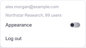 Prototype changed. Capture again to compare.
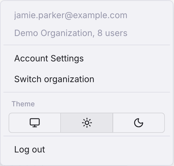
View data diffBoth sides are element captures of the open menu; production at DPR 2, prototype at DPR 1. No pixel score or measured size comparison is assigned. Captured 30 September 2026 with field replacement before rendering; names, emails, organizations, IDs and account values use synthetic values. | |